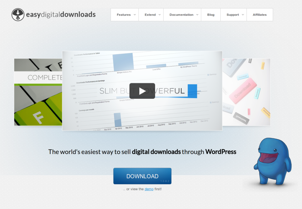
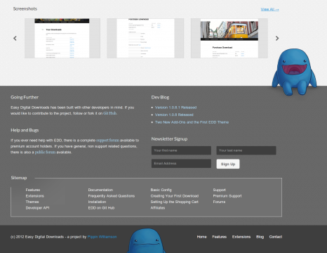
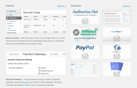
The official website for Easy Digital Downloads, a plugin for selling digital products, has just gotten a large redesign. The new design features a much simpler layout, better flow of information, and overall better visual appeal.
During the design process, there were several things that we really wanted to improve upon:
- Presentation of information on the home page
- The amount of time it takes to grab the reader’s attention
- Memorability
1. This was definitely improved in a lot of ways. One of the things we did was to cut away excessive amounts of information. The old design had a lot of different sections with multitudes of information, but we have managed to condense this down to just a few sections now, with each section merely showing a preview of the total amount of information.
2. Catching the reader’s attention is, for obvious reasons, very important. The old site really didn’t do a good job of this, but I personally feel that with the new design, visitor’s attention is grabbed quickly and easily. The large tagline, just under the preview video, is bold, crisp, and to the point. The large, attractive download button also encourages readers to click it and download the plugin.

3. In order to help ensure that readers don’t just land on the home page, bounce, and never come back again, we wanted to make the site memorable; we wanted users to land on the site, see it, and remember it, so that if they ever came across it again, they’d think: “hey, I remember seeing this before”. We have done this by introducing a site/plugin mascot. His name is Edd and he is a funny blue monster (or FBM).
Edd was drawn by the extremely talented Tim Von Rueden, who works as a concept artist and educator for CG Cookie, Inc.
The main site design was done by Chris Honninger, who is a good friend I have worked with quite a few times in the past. He is also responsible for the new EDD logo, as well as the logo here on Pippin’s Plugins.
What do you think of the new design?
[box style=notice]The new design launch is being celebrated with a 15% off coupon for all premium extensions. Just enter EDDTHEFBM at checkout.[/box]


Hi edd! You look awesome!
Very nice new look, very well done! Only thing I don’t like are the AdSense ads in the presentation video. I would recommend removing these.
Btw: I featured your plugin on my site http://wpgoodies.net/. And look – it’s the most liked item!
I’ve removed the adsense. Thanks for catching that 🙂
Thanks for the feature!
The new design is looking great Pippin, awesome work! I really like how sleek and elegant it is now.
My one thought is that you might benefit from making it even clearer that the core plugin itself is free. Given how good the site looks now, I’d expect it to be something you have to pay for. Highlighting that it’s free can only make it more appealing in that first impression.
And Edd rocks, especially the name 😀
Thanks for the feedback, Michael! You’re definitely right about the word “free” needing to be present.