Before starting this, I need to be completely honest: I really dislike page builders. In the last few years, page builder plugins (and those built into themes) have quite possibly caused more headaches for me and my support team than any other single category of plugins available for WordPress. This overall experience, and one too many support tickets related to a builder in a week, culminated in the following Twitter rant:
I’m sorry is this hurts anyone feelings, but seriously, all of the majorly popular page builders for #WordPress are terrible.
— Pippin Williamson (@pippinsplugins) September 14, 2016
Not only do they typically have incredibly subpar user experiences, they are easily the biggest compatibility problem for other plugins
— Pippin Williamson (@pippinsplugins) September 14, 2016
The sheer number of tickets that would NOT land in my system every week if they weren’t a thing is crazy.
— Pippin Williamson (@pippinsplugins) September 14, 2016
They break other plugins every day through their incredibly non-standard methods of content “building"
— Pippin Williamson (@pippinsplugins) September 14, 2016
I’m all for a good page builder, but if that means screwing over compatibility with other plugins’ ability to use standard WP features, stop
— Pippin Williamson (@pippinsplugins) September 14, 2016
These tweets garnered a fair amount of attention in the form of agreements, questions, and denial. Throughout the various small conversations that followed, I began to realize that I had never once truly used any of the page builder plugins that I was moaning about. Sure I had seem them countless times in our support system–usually in a negative light–but I hadn’t actually used one.
With that realization, it only seemed right that I take the time to truly try each one and give them a full review, so here we are.
Why page builders exist
There are many different answers to the question of “why?” but I think they can generally be summed up to this: people want them.
As much as they often cause difficulties for me and my team, I cannot deny that page builders have a huge audience of eager customers. Clearly they exist and thrive because the market demands them.
Chris Lema answered “why?” well in his recent blog post:
Simple. They offer customers a solution for personalization that mass-produced themes can’t offer, while at a lower price than working with a professional web developer and web designer.
I cannot argue with the utilitarian and economical purpose of page builders. I do feel, however, that page builders currently pose a severe problem to the WordPress ecosystem. They have become so ubiquitous that many site owners do not even realize that page builders are not part of WordPress.
On one hand this is great! It clearly shows value and demand for page builders. On the other hand, however, it can be detrimental to the overall WordPress project and user experience.
The problem with page builders
Last week I had a customer open a support ticket and say that the interface shown in our getting started videos did not match what he was seeing. At first I figured this was simply due to the natural progression of user interfaces overtime. We had made some changes recently so some of the options shown had different labels, different appearances, etc. What I discovered, however, was that the “difference” he was seeing was due to a popular page builder plugin. His edit screen had a visual page builder. Our getting started video did not. His sole experience with WordPress began with a theme that included a page builder, making him naturally believe that was the standard for all WordPress sites.
There are several prominent themes for WordPress that have a huge market share. Because of the sheer scale of their market share, these themes have extraordinary power to influence the expectations of a sizable percentage of WordPress users. When these players introduce extensive page builders, and other non-standard features, it is easy for their user base, who are typically non-power users of WordPress, to obtain a skewed perspective of what is “default” in WordPress.
I do not intend to say that we shouldn’t be influencing “default” perspectives–doing that is how we push forward improvements–but I do firmly believe that the creators of these page builders have a responsibility to be very careful. Unfortunately these themes, and the associated page builders, are not particularly known for incredibly high quality products or for actively participating in development of WordPress itself. This is not typically a direct concern for non-power users, but it does greatly affect them when these products result in problems with other WordPress products.
The page builder ecosystem is a wild west right now and is in a gold rush. A lot of different players are building their own versions and many are reaping good rewards for their efforts. I am all for teams building solid products and being rewarded for their efforts.
What the page builder industry is severely lacking is standardization. There is zero standard to how page builders should work. This shouldn’t surprise anyone as this is exactly what happens in every ecosystem that experiences a gold rush. Just look back a year or three to the commercial theme industry to see an excellent example of this. Thankfully these lacking standards tend to work themselves out as products mature.
In any large ecosystem where developers are free to build their own visions of products and openly offer those to the world, it should be expected to have a lot of variation. It is the incredible diversity in page builders that I believe is one of the primary sources of problems right now.
Okay enough of that, let’s get into the reviews.
The review process
For this review process, I felt there were several important factors that needed to be looked at for each of the plugins:
- How easy are they to use.
- How well do the builder interfaces translate into the final presentation.
- How much do they lock users into the system once used? Does the content display properly if the builder is deactivated? Does the content even exist after deactivating the plugin?
- Can filters such as the_content still be used to affect the final page content? This is incredibly important for compatibility with many other plugins.
- Are there any compatibility issues with frequently used methods in plugins (such as we see in our support systems)?
While not a super definitive list, I felt that these five criteria provided a fairly robust baseline for judging each plugin. With each plugin being different and them each offering their own unique feature set, I opted not to judge any of the plugins on the features they had or didn’t have and, instead, judged purely based on these five points.
In reviewing these plugins, it would be very easy to fall into a rabbit hole and spend hours upon hours setting up test sites and building sample page layouts. It may seem counter-productive to review page builders and not test building extensive layouts, but I really wanted to cover the basics and identify each plugin that suffered from or caused some of the common compatibility issues we see.
For each plugin, I did the following:
- Activated the plugin in a fresh install using a default theme without any other plugins active.
- Obtained a quick opinion of the overall interface of the plugin. Does it clash with standard WordPress interfaces? Is it obtrusive? Does it flow and feel natural?
- Tested the builder on the default Sample Page created by WordPress to get a quick feel for the overall interface and feature set of the plugin. This included using the builder to create a quick layout with several different elements to confirm the builder displayed properly in the default WordPress theme. As surprising as it might be, there are a huge number of plugins that display poorly in the default themes so this is always one of my first tests. If the plugin doesn’t work well in a default theme, how can we expect it to work well in other themes?
- From the edit screen of the Sample Page, I toggled the builder interface on and off in order to ascertain how well the builder supported using the standard WordPress editor and the builder simultaneously.
- Deactivated the builder plugin and then re-visited the Sample Page to determine what extent of content-loss deactivating the plugin caused. Ideally there should be zero content lost.
- Activated AffiliateWP, AffiliateWP – Affiliate Area Shortcodes, and Restrict Content Pro and then tested some of the features within these plugins that were known to fail frequently with page builders. I chose these plugins because I am intimately familiar with them, am aware of several compatibility issues with page builders, and I know that I have already taken serious effort to resolve many compatibility issues.
- Wrote down quick notes for each plugin for “good” and “bad” items based on the steps outlined here.
Common compatibility issues
In our support queues, we see several common problems with page builders, each of which I wanted to test for in this review.
First, we see a lot of cases where inline scripts loaded in a shortcode fail. For example, our [register_form] shortcode in Restrict Content Pro conditionally loads javascript and CSS files on the page the shortcode is included on. We sometimes see the files fail to load due to the way the builder plugins modify the content of the page, which breaks some of the standard WordPress shortcode detection methods, such as has_shortcode().
Second, we see site owners often try and use opening and closing shortcodes across page builder elements. This is common with the restrict shortcode in Restrict Content Pro. A lot of page builders are not able to adequately support opening and closing shortcodes when they are placed in different rows or columns in the builder.
Third, we see a lot of cases where plugins, such as Restrict Content Pro, are unable the modify the page content through the the_content filter when a page builder is used. As filtering the content is an incredibly common thing for plugins to do, I wanted to thoroughly test this with each page builder.
Fourth, we see frequent instances where page builders mess with content formatting of shortcodes added to builder elements. For example, some builders will cause extra paragraph tags to be added around HTML output by a shortcode, resulting in very poor frontend display of the shortcode that is completely different from what it would be if added directly to a page not using a builder.
The plugins reviewed
When I first started working on this, I planned to review all page builders, including those built into themes, but I backtracked on that idea once I realized judging a theme-specific page builder against a theme-agnostic page builder made as a plugin was not a fair nor accurate comparison. It’s for this reason that Make, Headway, Layers, and some others are not included.
I originally planned to review only the builder plugins I was aware of (typically those that cause problems in our support queues) but then opted to review as many as I could find in order to be as pragmatic as possible. Perhaps some of the builder plugins never made appearances in our support queues because they were awesome and didn’t cause any problems.
With the sheer number of plugins available, I know for a fact that I was not able to include every page builder plugin, but I do believe I managed a fairly extensive list that includes all of the most prominent players in the market.
Here are the plugins included in this review:
- Beaver Builder
- Visual Composer
- Tailor
- Fusion Builder
- Divi Builder
- Thrive Themes Content Builder
- PageBuilderSandwich
- Brix Builder
- Conductor
- Site Origin Page Builder
- Elementor
- Pootle Page Builder
- Live Composer
I feel it is important to mention that the reviews and opinions expressed here are solely my own. No sponsorships were requested or accepted for these reviews and the license costs for all plugins (when necessary) was paid in full from my own pocket.
There are no affiliate links on this page.
Alrighty, let’s get on to the actual reviews!
Beaver Builder
Over the last few years I’ve heard nothing but great things about Beaver Builder. It is a commercial plugin that constantly gets great reviews and has been doing very well on the commercial front. I’ve read many of the reviews of the plugin over time but this was my first opportunity to use it.
I am a firm believer in first impressions. The good news for Beaver Builder is that they have a strong reputation as a high quality product, leading me to have good expectations for it. Unfortunately for Beaver Builder, my first experience with it was immediately tarnished by this:
I had purchased a Standard license, which, as it turns out, does not include support for WordPress multisite. I have found multisite to be one of the greatest assets in quickly spinning up fresh WordPress sites for testing. I understand that this limitation was done intentionally to prevent customers from activating the plugin on numerous sites within a single network, but the user experience here was quite poor.
Being a developer, I said “like hell I can’t use it on multisite” and quickly found the logic inside of the plugin, removed it, and went on with testing.
Thankfully, the rest of my experience with Beaver Builder was much better than my first impression.
Upon loading the page edit screen, I was pleased to see a clean, unobtrusive interface. Too many page builders include massive, colorful buttons that just stick out like a sore thumb. Beaver Builder added theirs in a nice, tasteful manner.
Clicking on Page Builder takes the user into a front-end interface that feels relatively similar to the customizer.
The overall interface of the builder was pretty intuitive and worked well. I especially liked that it all felt pretty native to WordPress.
I went ahead and used the builder to create a few simple layouts and each worked well. I then proceeded to test the plugin with the steps outlined above in the review process.
Overall, very few problems were found and none of the common compatibility issues I detailed above appeared to be present in Beaver Builder. This is very good so far.
One of the great things about Beaver Builder is how well it retains content when switching the page builder off or deactivating the plugin. Retaining content is incredibly important for a good user experience. Imagine the anguish it could cause if a user was to construct an extensive page, decide to use a different builder, and then discovered that all of the content placed within the builder was lost completely when it was switched off.
I did, however, find a few pain points that I would like to mention. Some of these are not inherently bad, but, depending on the scenario, could result in unpleasant user experiences.
My first criticism for the plugin has already been mentioned, and that is the lack of support for WordPress multisite in the standard license. I’m entirely fine with limiting the number of domains the plugin is activated on but this limitation should not affect my ability to use a core WordPress feature.
Second, I found that a large number of the builder elements, such as contact forms, are not retained when the plugin is deactivated. This is because Beaver Builder includes its own proprietary contact forms, testimonial blocks, subscribe forms, image sliders, and many other content types. While it makes perfect sense to include these, it is important that users be aware of how they will be locked into using Beaver Builder once opting to add these kind of elements to their pages. This is where the separation between layout building and content creation becomes very blurry.
Third, Beaver Builder makes heavy use of icons through out its interface. Inherently icons are not bad, but when not combined with proper labels, icons can be disastrous for accessibility and are, overall, not very intuitive. In numerous cases it took trial and error for me to figure out exactly what each icon used did.
Overall, I was very pleased with Beaver Builder, especially as it did not present any of our known compatibility issues.
Visual Composer
Perhaps one of the most widely used page builders, Visual Composer is a commercial plugin created by WPBakery and is available from Code Canyon.net. Aside from being one of the earliest page builders, a large part of its popularity comes from it being bundled in a huge number of commercial themes on Theme Forest.net.
On one hand, Visual Composer has been perhaps one of the most challenging for me and my support team as it has had frequent compatibility issues with our plugins and others. Yet on the other hand, Visual Composer is also very good at building plugin-specific add-ons that add feature sets for other popular plugins, especially eCommerce plugins.
When activated, Visual Composer adds a large blue block with several buttons to the top of the edit screen. This block provides toggles for enabling the visual editor, classic mode (default WordPress), and a frontend editor.
I don’t particular care for the obtrusive format or style of these buttons. They just feel unnatural and are too much “in your face”.
Once enabled, the visual builder is pretty intuitive.
There are a few things I like about this interface. First, the icons, while still a bit too heavily used, are simple and have pretty clear meanings. Second, the interface does not feel cramped. Even though there is a lot going on, everything still has space to breath. It’s quite well laid out.
From a user perspective, it is nice to get a pretty accurate What-You-See-Is-What-You-Get view. The developers at WPBakery have done a good job with the drag-and-drop aspects of the builder as well. Too often drag-and-drop interfaces end up being choppy and jagged, but the one in Visual Composer is pretty smooth and works reliably.
In the same vein as a good WYSIWYG on the backend, Visual Composer also provides a complete frontend editing interface that truly is a WYSIWYG experience.
When strictly using the visual editors, the Visual Composer experience is quite good. I don’t personally care for much of the stylistic decisions made with the Visual Composer interface as they really don’t blend well with native WordPress interfaces, but that’s largely just personal preference.
It is an overly broad generalization, but I’ve found that most developers that do not take the time to blend their own interfaces with the native WordPress interface, do not typically have great care for the overall user experience nor do they care greatly for WordPress itself. I cannot say if this holds true for the Visual Composer developers and, like I said, it is a very broad generalization, but it’s one I’ve found to be pretty accurate in my own experiences. It is one thing to strike out against standard user interfaces in order to create something better, and it is entirely something else to go drastically against style choices simply for the sake of it.
Along with my own personal distaste for the lack of style continuity in Visual Composer, there are two primary issues I found with it.
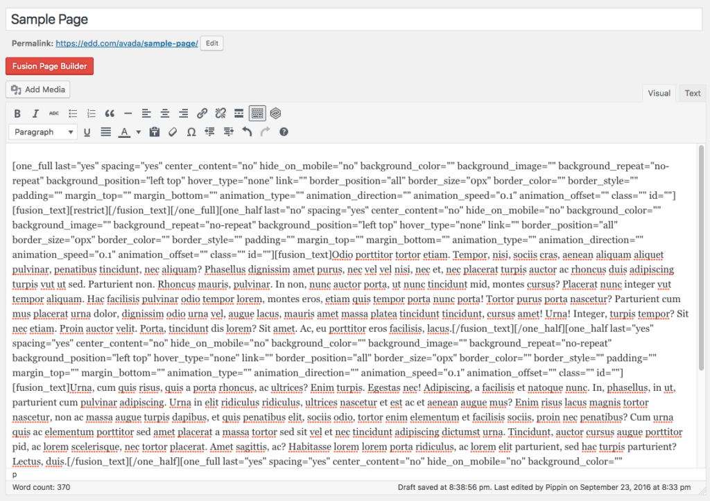
First, Visual Composer has a really, really strong lock-in effect due to its use of shortcodes for layout construction. Here’s a screenshot of the page editor after switching back to Classic editing mode (default WordPress):
Notice all the shortcodes? For this screenshot, I built a very simple page with three rows and two columns. For that, three separate shortcodes were added to the page in order to create the layout. Now imagine a much more advanced layout that includes numerous columns, many rows, and a lot of other builder elements, such as buttons, contact forms, images, etc. The sheer number of shortcodes added to the page makes it nearly impossible to comfortably edit the page in the classic editor. For anyone that wishes or needs to switch back and forth between editing modes, this is a very poor experience.
The heavy use of shortcodes also makes it a serious chore to ever disable Visual Composer and use something else, even just default WordPress. The site editors would be required to go through and remove the countless shortcodes from every single page that Visual Composer ever touched.
Non-technical users may not care how it works behind the scenes, but they will care about the amount of work removing Visual Composer if that ever become necessary.
The second issue I found is one of the common compatibility issues I mentioned above related to shortcodes.
Opening and closing shortcodes work properly within individual elements but they do not work across elements. Take the following screenshot as an example.
The edit window is editing the contents of the very first row. You can see I added a [] shortcode to it. At the bottom of the screenshot, you can see the closing [] shortcode. We’ve found this to be a very common practice with these kinds of shortcodes because site owners want to restrict a portion of the page while still retaining control of the layout within the shortcodes.
When rendered, the shortcode parsing breaks as shown in this screenshot:
Visual Composer has some really nice aspects to it and is overall a very well functioning page builder, but I would personally avoid it due to the severe lock-in effect.
Tailor
This was a page builder I had not heard of until several people recommended it in response to my Twitter posts. It is available for free on WordPress.org and is built by Andrew Worsfold.
After activating Tailor, one of the very first things that caught my eye was the level of care with which Andrew integrated his plugin’s interface with the native WordPress UI.
It looks and feels exactly like native WordPress. I love that. It uses a Customizer-like interface that gets out of the way while still being very intuitive.
Another positive note for Tailor is the lack of icons for actionable items, making it easier for a site editor to quickly understand what each option does.
One of the few “complaints” I’ve found from other users of Tailor is that it’s not as feature rich as many of the other builders. After thinking about this for a while, I’ve decided that the fewer features offered by Tailor is actually a hugely positive note for the plugin. So often people get caught up on whether a plugin has tons of features or is an all-in-one package without stopping to think if the plugin should offer those features.
Many of the other page builder plugins include options for contact forms, testimonials, post sliders, and so much more. Tailor offers a few of those items but it distinctly limits them to a few more basic ones. Personally I really like this because I don’t believe page builders should be providing contact forms and other major feature sets. A builder should be for creating layouts, not handling email submissions. Those features should be handled through other plugins, such as a real form builder or image slider plugin, and then simply added to and displayed within the page builder’s layout.
Tailor walks the fine line between layout building and content creation / collection very well.
Another thing Tailor does well is content retention when the plugin is deactivated. None of the content is lost. It also has a really excellent admin-side representation of the frontend layout, giving it a great WYSIWYG experience.
There were only two negatives I found with Tailor, one being a compatibility issue and one just being a minor quirk.
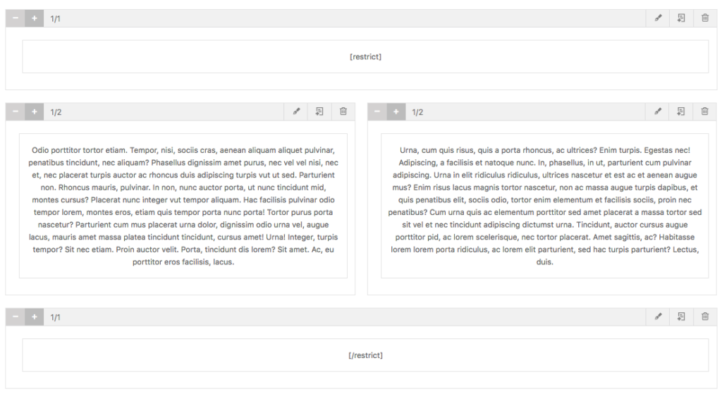
First, shortcode openings and closures do not work properly across rows and columns. Look at my first screenshot above and you’ll see at the bottom. The first content block has the opening shortcode.
The second problem is simply that the drag-and-drop is sometimes a little rough. Elements tend to jump around a bit while trying to place a new one on the page. This is pretty minor but a smoother drag-and-drop would be excellent.
Overall, Tailor is a really excellent page builder that I would not hesitate to recommend to users.
Thrive Visual Editor
The Thrive Visual Editor plugin is built by Thrive Themes but is theme-agnostic, so it works with more than just their own themes. It is a commercial plugin that seems to have a pretty large customer base.
I’ve run into Thrive Visual Editor numerous times in our customer support channels but have not had any real experience with it before purchasing a license to test for this review.
The first thing I notice about the builder is it’s pretty reserved in how it adds its interface to the edit page screen. It’s not perfectly smooth and does stick about a bit, but it’s much more minimal than many of the other builder plugins.
Clicking on the Edit with Thrive Content Builder button takes us to a new, frontend builder that looks like this:
Hovering over an element on the page shows an outline with three options: drag-and-drop ordering, duplicate, and close.
I rather like this because it stays away from abundant, hard-to-grok icons.
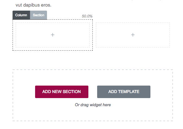
Adding new elements to the page is quick and quite intuitive. I really like the interface they’ve created for adding column layouts. Instead of using weird icons or other mechanisms for controlling the number of columns, they simply give you options for each division option:
It’s simple and intuitive. While all page builders strive to build an intuitive layout builder, I think Thrive Visual Editor has possibly done it the best of all, or very close to it.
There is really only one problem I found with the plugin. Shortcode parsing works, script loading works, everything works great in fact, but there is one major issue that, for me at least, is serious.
The Thrive Visual Editor plugin has 100% content lock in. Let’s compare the admin edit screen to the frontend edit screen for the same page.
Admin:
Frontend:
Notice the difference? None of the content added through the visual editor is shown in the admin. Instead of working with the existing page content, Thrive Visual Editor simply overwrites the page content. That also means that if you deactivate the plugin, all of the content added through the plugin is gone. Poof, vanished.
All page builders should strive to retain as much standard behavior as possible. Unfortunately, Thrive Visual Editor fails badly here, which is really too bad because if they had avoided the complete content lock-in, this would be one of the best page builders available. Unlike nearly all of the other page builders, Thrive Visual Editor does not suffer from a single common conflict that I could find, but the content lock-in is dangerous. For that reason alone, I would avoid using the plugin.
Fusion Builder
Fusion is the page builder from Theme Fusion, the creators of the notoriously popular Avada theme. It is quite possibly one of the most wide spread page builders due to its inclusion in the Avada theme, which is the most widely used commercial theme of all time.
Before going further, I need to include a reminder about one of the conditions for being included in this review. I chose to review only theme-agnostic page builders made as a plugin. So it needs to be a plugin and it needs to work with all themes.
The Fusion Builder appeared to fit this criteria as it is built as a plugin, so I went ahead and continued the review of it. That is, however, about as far as I got because, as it turns out, Fusion Builder is built as a plugin that can be activated on any theme, but it fails drastically if it is used on any theme other than Avada.
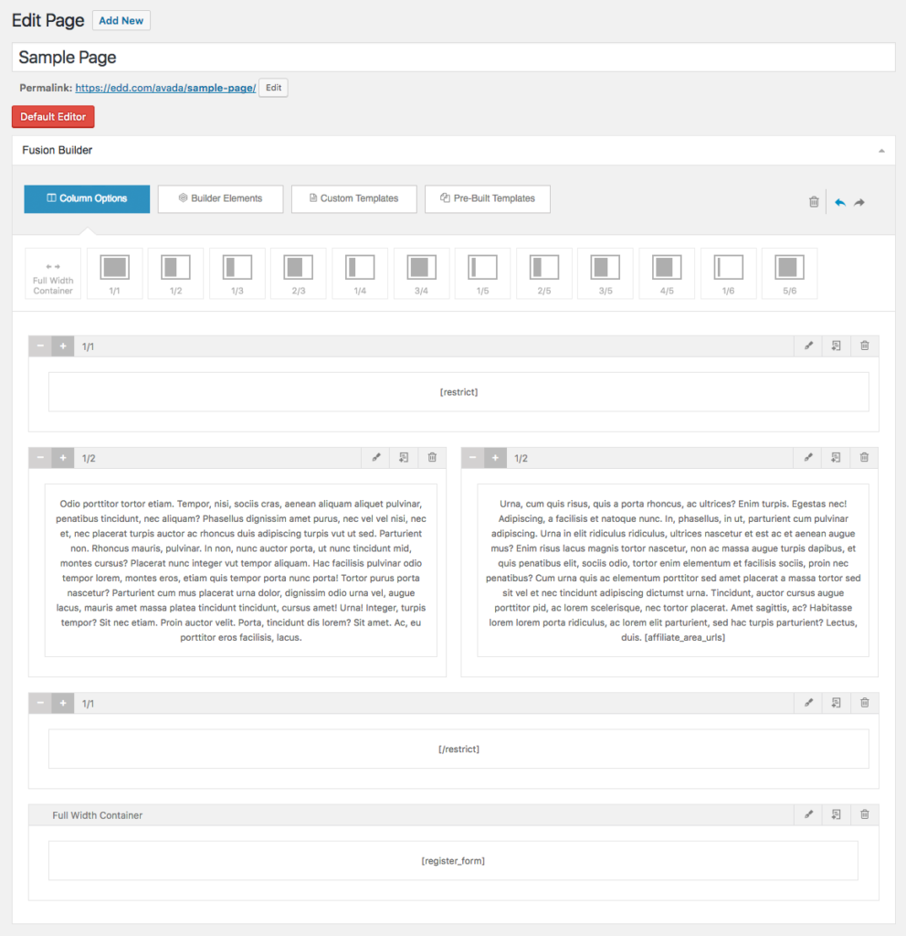
Here is the builder with Avada activated:
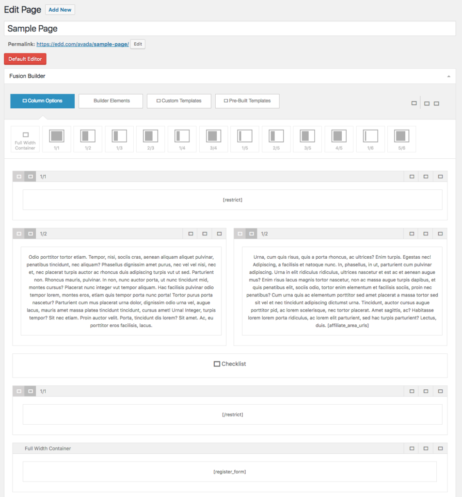
And here it is without Avada activated:
The builder shows up and sort of functions. The options at the top for selecting elements all work and new elements can be added to the page, but none of the icons show up and you cannot actually edit any of the content.
The frontend view is even worse, however, because it doesn’t function at all. None of the layout elements show up. Zip, zero, zilch.
Without Avada, Fusion Builder becomes a car without an engine.
I understand building a theme-specific builder but why on earth would you build a theme-specific builder plugin that only works with one theme? At that point you’ve simply made it harder for your customers to get all the features of your theme without any added benefit. If Theme Fusion offered a whole suite of themes, having a builder plugin that works exclusively with their themes would make sense, but they don’t! They make one theme: Avada.
In my mind, this is a fatal flaw that automatically discounts Fusion Builder as a viable option, unless of course you’re using Avada.
Now, all of that being said, I’d like to still give the builder a full review like the other plugins so I went ahead and activated Avada and tested out the builder.
Easily one of Fusion Builder’s greatest strength is its interface design. It is incredibly smooth and overall pretty intuitive. I really like that the entire builder experience is inside of the standard WordPress edit screen. Its design even blends into WordPress quite nicely.
I tested for each of the common compatibility issues we encountered and found mixed results. Standard shortcode parsing and script loading worked perfectly fine, as did filtering on the_content, a very common method employed by countless other plugins.
There were, however, some additional negative sides to the plugin beyond the reliance on Avada mentioned above. First, layouts are constructed using shortcodes, making the possibility of editing outside of the page builder an excruciatingly painful experience. Have fun editing this:
Aside from the painful text editing experience using shortcodes like this creates, it also results in bad content lock-in. If a user deactivates Fusion Builder and is then met with the mess above, they’re probably just going to reactivate the plugin instead of trying to clean it up.
Like most of the other page builders, shortcode enclosures also do not work across builder elements. In an ideal world, the following should work but does not:
Before finishing this review post, Theme Fusion reached out to me to let me know that they are actively working on a new version of Avada and also a new version of the Fusion Builder plugin and, reportedly, the new version is actually theme agnostic. I was also provided with a copy of the new versions but some technical issues prevented me from fully testing them so I cannot say how substantial the improvements are, but it is something watch out for if you are an Avada customer or interested in Fusion Builder.
Page Builder Sandwich
I was not aware of Page Builder Sandwich before my posts on Twitter but several people said I should take a look at it. There is a free version available on WordPress.org and a premium version available from the developer’s website. For this review, I chose to stick with the free version as it covered all of the necessary basis for the review.
Once activated, Page Builder Sandwich adds a new metabox to the edit screen with a Edit with Page Builder Sandwich button. While I don’t love the color scheme (I don’t see a reason to not match the WordPress colors), the button is otherwise not intrusive so I have no issues with it.
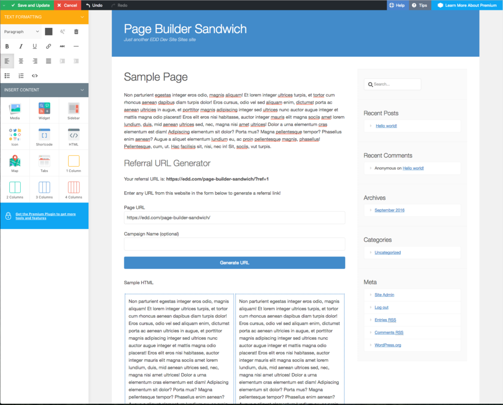
Clicking the new edit button takes us to the frontend where we’re presented with a WYSIWYG editor:
This view does jump drastically outside of the WordPress look-and-feel, something I’m really not fond of. It’s a rainbow of unnecessary colors.
The Referral URL Generator form you see comes from AffiliateWP and was used as a test to see how well shortcodes that load CSS/JS work inside of the builder. Page Builder Sandwich got top marks here as everything worked perfectly, even the WYSIWYG aspect.
The layout editing interface is pretty intuitive and quite powerful. One of my favorite aspects is how the exact spacing between any and all elements can be easily controlled with a simple drag bar. It’s quite nice.
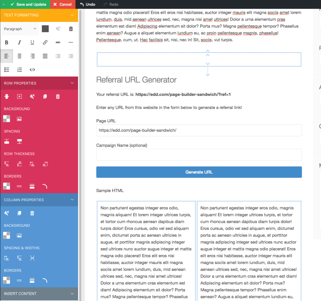
When adding a new layout element to the page, the toolbar on the left expands with additional options:
Page Builder Sandwich has a few other strong points going for it.
First, shortcode enclosures work properly across elements. Unlike most of the builder plugins, opening and then closing a shortcode with columns, rows, etc, in between all works properly.
Second, there is zero content lock-in with Page Builder Sandwich. The plugin can be deactivated and all content is still available. Users can even continue to edit their content in the standard WordPress page editor if they wish.
There are really just two issues I have with the plugin. A couple of times I found myself in trouble as some of the layout elements got jumbled (for unknown reasons) and were sitting on top of each other. When this happened I couldn’t figure out how to delete the problem elements. I suspect this is due to a minor javascript issue that could be easily resolved once identified.
The second issue I have is very minor but still important in my view. I really don’t care for the aggressive color schemes. As I’d mentioned numerous times here and in other posts, I care greatly for maintaining the WordPress color scheme and style choices. The interface in Page Builder Sandwich is a stark contrast to the standard WordPress UI. In my mind, it creates an unnecessarily jarring experience.
Beyond those two items, it is an excellent page builder.
Brix Builder
Next on the list is Brix Builder. This was another new one to me but came recommended by several folks on Twitter so I gave it a go. It’s a premium plugin and starts at $69.
This is an aside but one I feel is important. One of my very first impressions of Brix Builder was quite negative, not because of their sales page, the price, or anything else about the product, but because I could not find out anything about the people behind the product. It is built and sold by a company called Evolve s.n.c but beyond that, there’s nothing. I believe greatly in the importance of trust and the willingness to put your face and name on your product. While it could be a simple oversight, I always question if there is an ulterior motive behind the decision to not publicly state the names of company owners.
Tip: put your face and name on it. To those whom trust is important, it can make all the difference.
I did go ahead and purchase a license and began playing with the plugin. Unfortunately, I was immediately greeted with a second poor impression as soon as I activated the plugin.
So immediately after installing the stand-alone plugin, I’m asked to install a separate framework plugin in order for Brix Builder to run. This is just a poor user experience with very little real benefit. I’ve seen a few companies do this but I’ve never been convinced it is a good idea. The standard argument for this approach is that the company can have multiple plugins that all use the same framework without requiring that each plugin bundle their own versions.
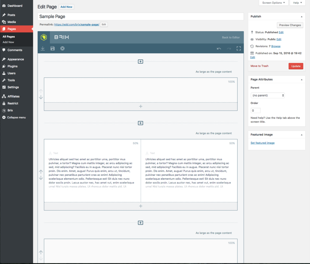
After getting the main plugin and the framework installed and activated, the builder looks like this:
The very first thing that I noticed (you may see a trend here) is that the editor interface is wildly outside of WordPress standards. A lot of people would call me a stickler here but I really do believe it matters a lot for overall user experience. The best experiences are always going to be the seamless ones. Brix Builder, like many of the other page builders, is definitely not a seamless experience.
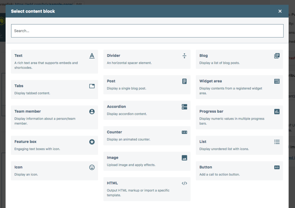
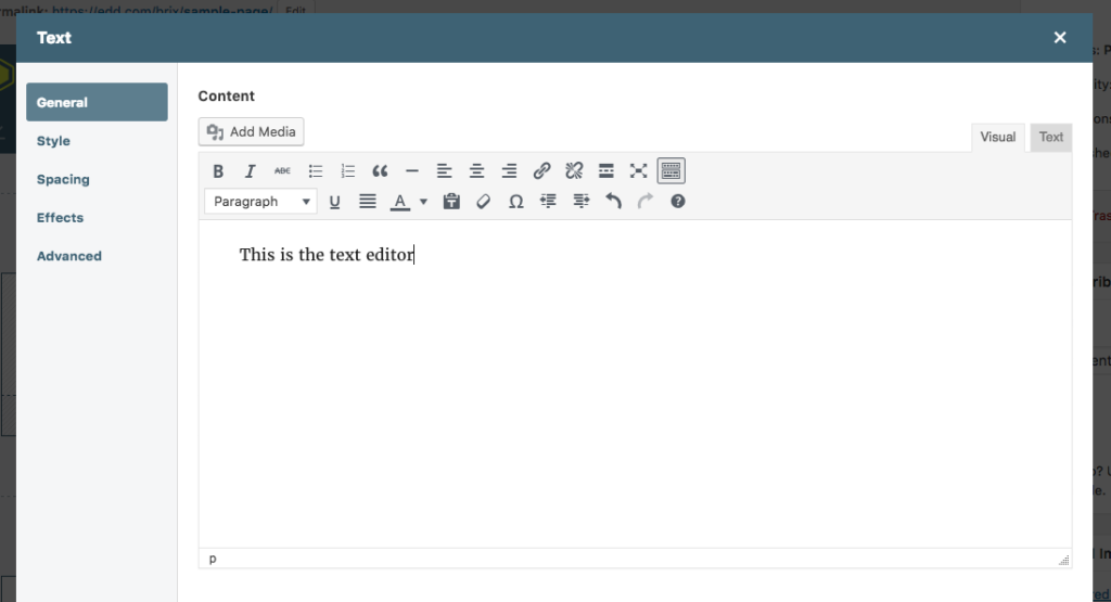
Aside from my initial distaste for the design decisions of the editor, the editing interface is nice and smooth and seems to work very reliably. Here’s a few more shots of the various screens:
In terms of usability and intuitiveness, I’d put Brix Builder near the top of the list of the builder plugins reviewed here. It’s quite good. They make liberal use of tooltips and help text, which can really help beginner users get acclimated.
After building a few simple layouts to get a feel for the plugin, I dove into my compatibility tests. Some of the tests passed with flying colors while others, unfortunately, broke down pretty poorly. There were three major compatibility issues.
First, shortcode enclosures do not work across builder elements. Putting an opening and closing shortcode in one element works, but trying to span multiple elements fails. For plugins like Restrict Content Pro, or any other that uses shortcode enclosures, this is a major problem that results in tickets landing in our support queues.
Second, once the page builder has been enabled, site admins cannot switch back to the default page editor without losing their layout. If a site editor was to build a layout, temporarily switch to the default page editor (perhaps to add HTML directly in the Text view), save the page, and then switch back to the builder, the complete layout would be gone. This is really, really bad. Imagine spending a few hours building a great layout then needing to use the default editor for a moment, only to discover that all of your work is now gone.
Third, due to the way that Brix Builder modifies the page content, it completely breaks other plugins ability to also modify the page content through the the_content filter, which is a critical piece of functionality that thousands of plugins depend on.
These three issues are significant enough that I cannot recommend Brix Builder as a good option, which is really too bad because the plugin works very well on all other fronts.
Conductor
Of all the page builder plugins, Conductor is one of the most unique. Rather than being a layout builder for the content area of pages, it is a layout builder for the entire page. Most builders are designed to work within a theme’s content area, but Conductor is different. Conductor takes over the complete layout of the page, including sidebars and allows site editors to control everything between the header and footer of the site.
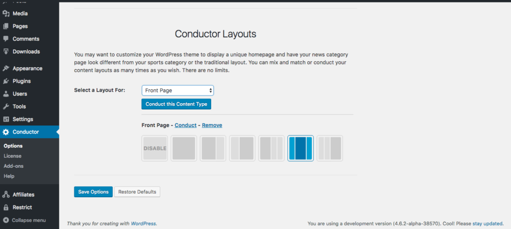
Conductor first gives site editors the option to choose a layout. This can be done for each page of the site, including all public post types.
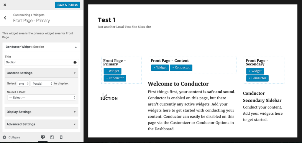
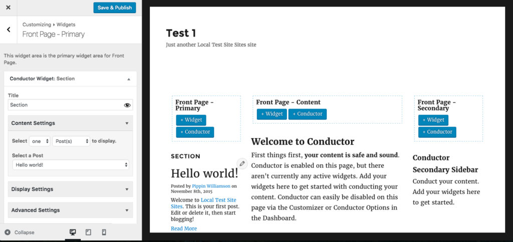
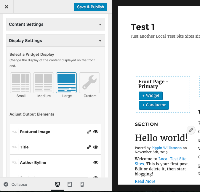
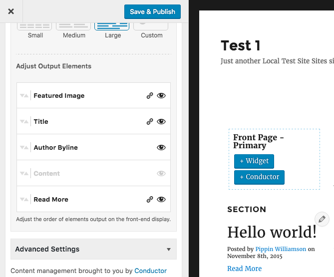
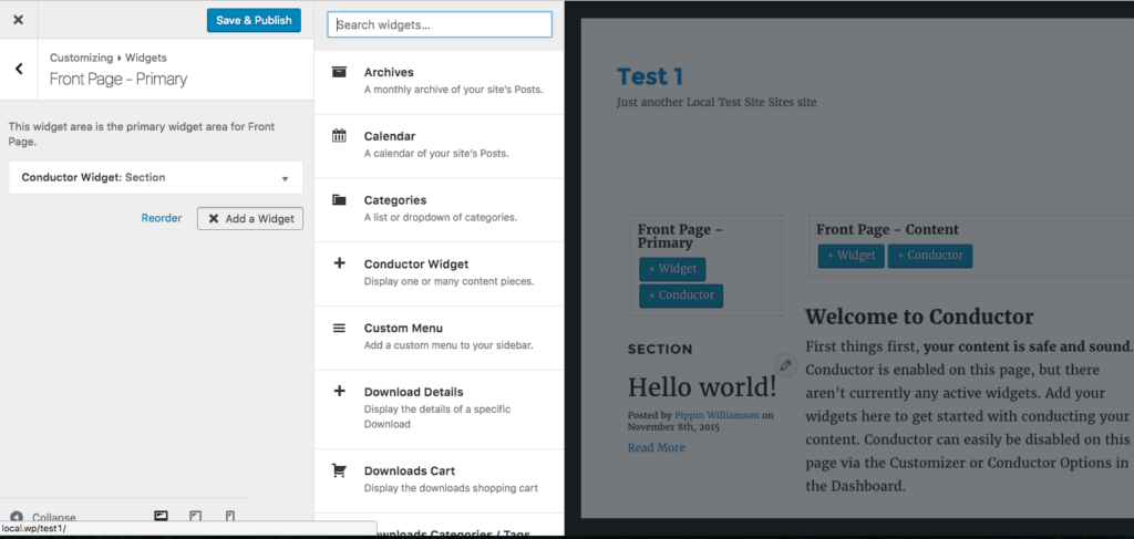
Once a layout is chosen, you’re put into the builder interface, which is very similar to the Customizer. From here, page elements and style options are controlled. Content is added to the page through widgets and “Conductors”, which is really just a custom widget with special options.
It took me a little longer to get used to how Conductor worked than it did the other page builders, but I think that’s largely due to my predisposed expectations of how page builders work.
One of the other major differences between Conductor and other page builders, is the lack of “bells and whistles”. In many page builder plugins you will find contact forms, testimonial widgets, tabbed content options, section toggle, and more. Conductor does not have these and, frankly, I think that’s a positive. I’m a strong advocate for keeping a plugin’s focus narrow, which Conductor does well. Too many builder plugins try to be an all-in-one solution.
I did find one compatibility issue and one primary weakness of Conductor.
First, inline scripts loaded directly from shortcodes do not work properly. It seems that the way Conductor loads the content and layouts prevents script loading from behaving like it would on a standard WordPress page. This causes problems for some plugins, including some of our AffiliateWP add-ons.
Second, due to the content being stored in widgets, the content of layouts created through Conductor will become inaccessible if Conductor is deactivated. All builder plugins should strive for 100% content retention when the plugin is removed to aide site owners in migrating to or from plugins.
At the end, I’m not entirely certain how I feel about Conductor. I do really enjoy their approach with a Customizer-like interface (similar to the Tailor builder above) and they have provided a feature that very few other builders have: complete control of the page instead of just the content area. This level of control does at times make Conductor more difficult to use because it means the site editor has to build everything, instead of just the content area. For some site editors, this will be a hurdle, but for others it will be a huge win.
Site Origin
A free offering from Site Origin, a plugin and theme development shop, the SiteOrigin Page Builder is one that I rarely hear anything but good about. For that reason, and it being commonly seen in our support channels, I wanted to give it a run for its money.
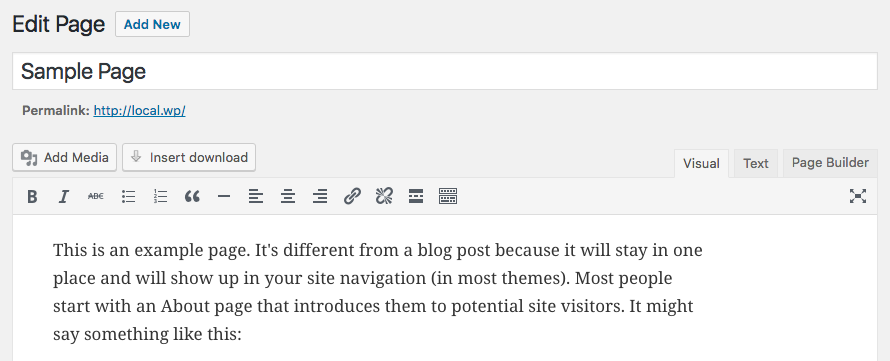
Once activated, a simple, elegant tab is added to the page editor:
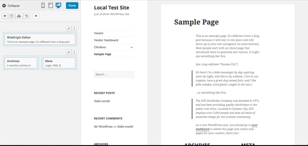
Clicking on the Page Builder button opens a prompt asking if we’d like to copy the existing page content over to the builder and then, once the prompt is accepted, we’re greeted with a similar interface to that of many page builders:
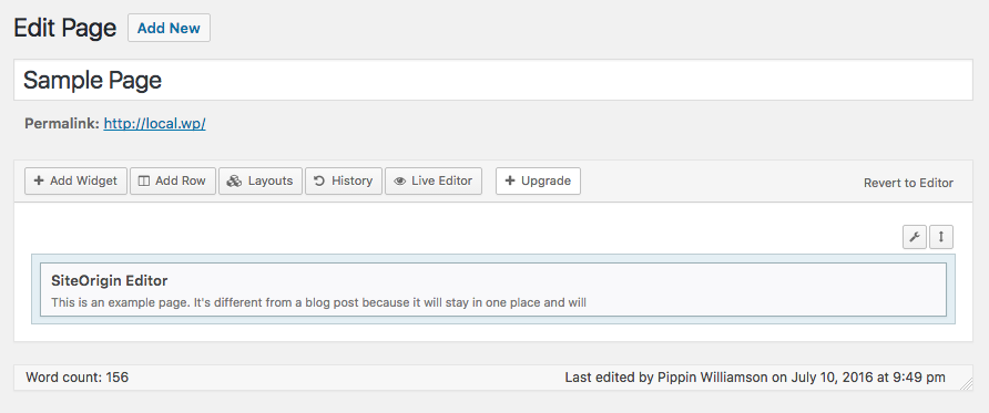
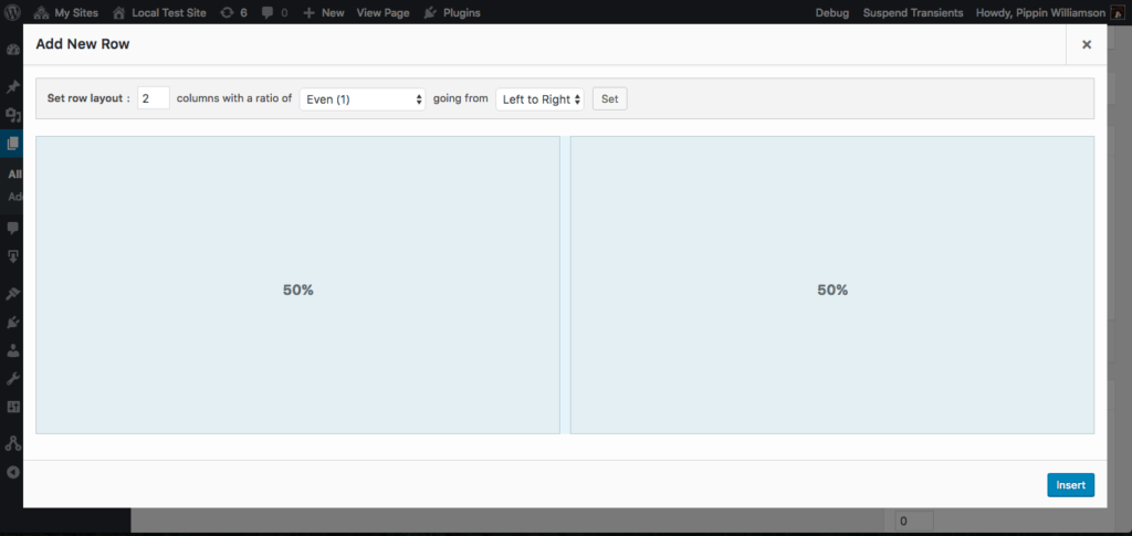
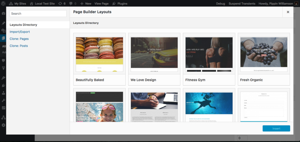
So far this seems pretty intuitive. We can add widgets, rows, and existing layouts with the tool bar at the top and edit the existing content by hovering over the element. There is even a live editor that provides a WYSIWYG view.
Overall, I really like the interface in SiteOrigin’s Page Builder. I did, however, run into a rather strange development decision.
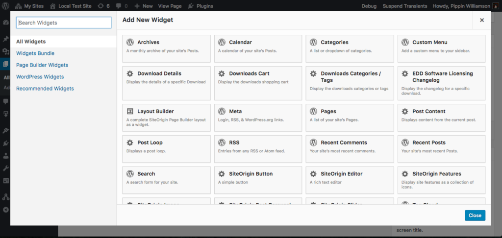
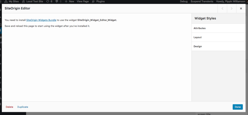
Once the page builder was enabled and the existing content was copied over to an element inside the builder interface, I clicked Edit on the default element and was presented with this:
In order to edit the default content of the page, we’re required to install a separate plugin called SiteOrigin Widgets Bundle. What? Why? It appears that the plugin contains a series of widgets, which is fine, but seriously, site admins should not be required to install a second plugin just to edit the default content of the page, especially when all other aspects of the builder function without it.
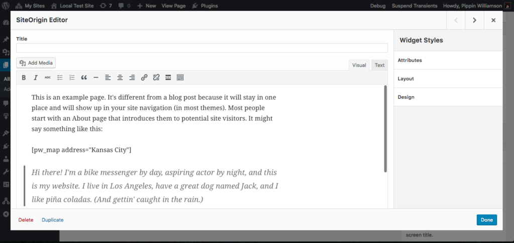
Once the widget bundle is installed, we can go back to editing the page layout as normal. Just weird though. Now our editor for the default page content looks like this:
After playing with the builder for a bit and getting a good feel for it, I have to say that I really like the user experience. The interface is great. It’s snappy, intuitive, and just works really well.
Sadly, all good things have to come to an end. Once I was done testing the default functionality of the plugin, which is superb, I dove into the compatibility tests. Some of the tests worked great and others failed. During these tests, I found a few other issues with the builder as well.
The first problem, just like almost all of the other builders, is that shortcode enclosures do not work across elements. This needs to work and is not difficult to do.
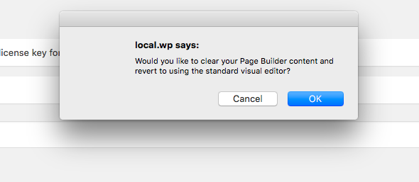
The second problem is that the builder interface and the standard page editor cannot be used simultaneously. If a site editor tries to switch to the regular editor, they are given a prompt:
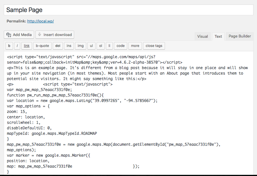
Clicking OK takes you to the standard WP page editor, but something really odd has happened. Take a look at the text editor now:
See all the JavaScript? That’s not supposed to be there. That JavaScript is the result of the [pw_map] shortcode, which you can see in the screenshots above. Switching from the builder to the standard editor preserved the content but instead of keeping the shortcode as it should, it rendered the shortcode and then saved the output. That means my shortcode is gone, poof, vanished. I cannot edit it or adjust the parameters of the shortcode anymore because the shortcode isn’t there, just the HTML of the shortcode is.
The third issue I found was that SiteOrgin Page Builder creates pretty significant content lock in. Most of the elements, and any content associated with them, added to a page are completely lost when deactivating the builder on a page or when deactivating the complete plugin.
These three problems are pretty significant, though they won’t affect everyone, perhaps not even a sizable percentage of the SiteOrigin user base, but they are problems nonetheless.
Divi Builder
The Divi Builder from Elegant Themes is one of the more widely used builder plugins, at least gauging by my own impressions based on how often it shows up in our support channels. I’ve always had mixed feelings on it as it has always seemed to cause compatibility issues with some of our plugins.
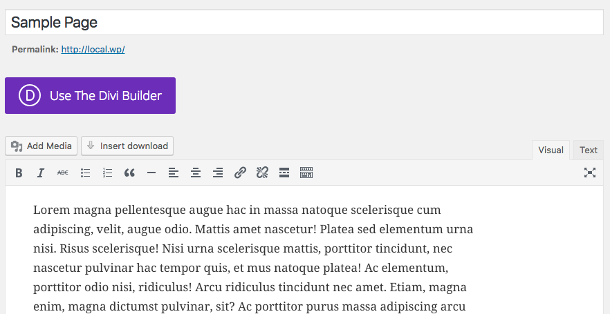
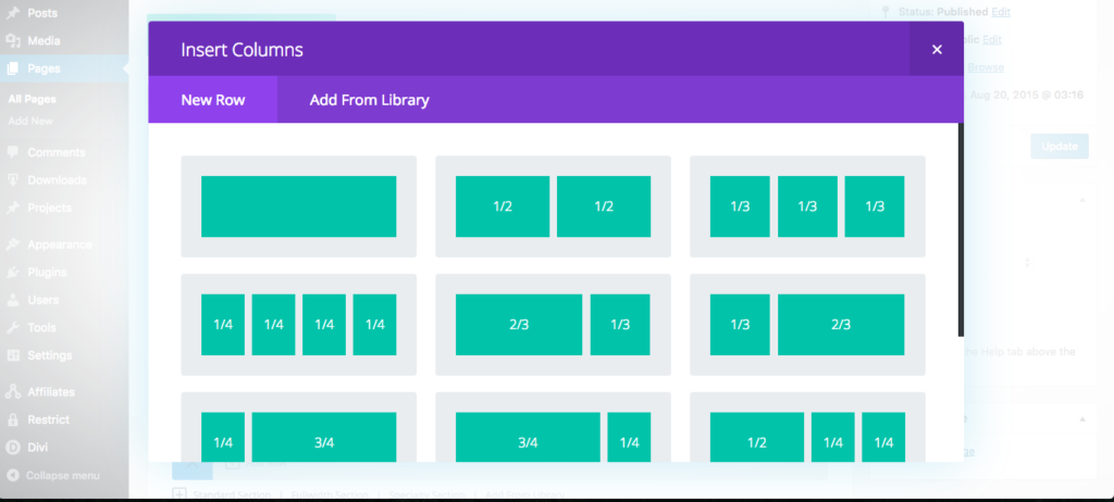
Once activated, a giant purple button is added to the page editor:
I will not hide it; I hate this button. It’s huge and purple for no reason other than to be blatantly obvious. It’s distracting and takes away from the fluidness of the standard WordPress interface.
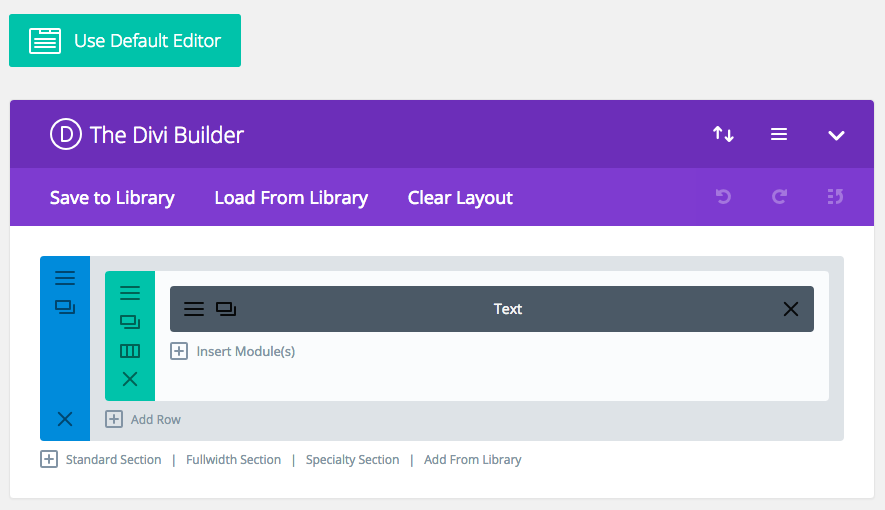
Know what I like even less than the button? The rainbow of colors in the builder itself.
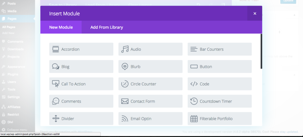
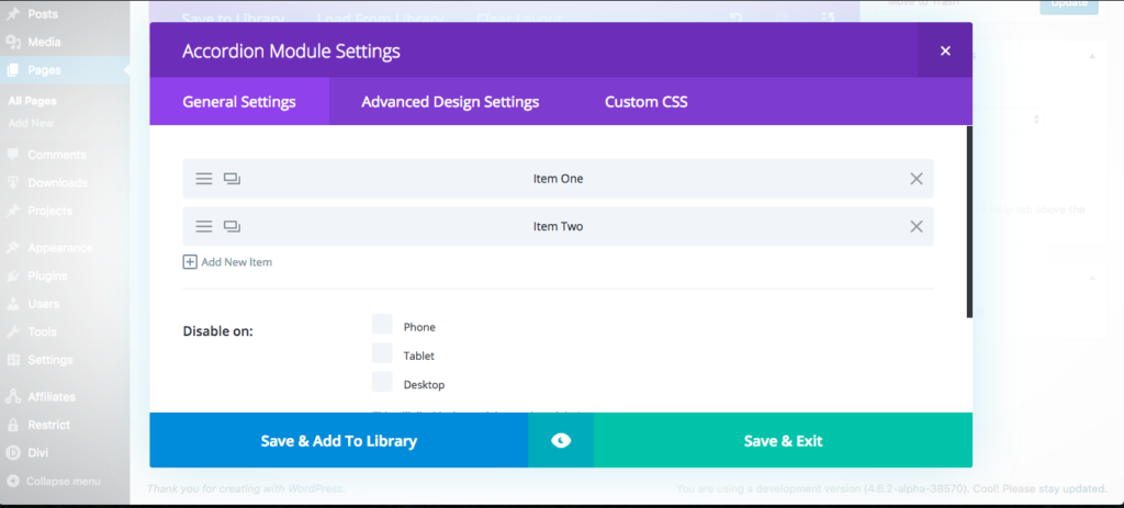
Beyond my distaste for the builder’s stylistic choices, it does work quite well. The interface is overall pretty intuitive, though it is pretty heavy handed on the use of icons.
Once I had a few sample layouts built, I again tested for compatibility issues and quickly found several.
First, the builder is overly aggressive with its frontend CSS. To test this, I added a registration form from Restrict Content Pro to the page. Here you can see first the form without Divi Builder active and then the same form with the builder active:
Notice how the second image has lost a lot of its margins and button styling. Those button styles shown in the first image do not come from Restrict Content Pro; they come from the theme. That means Divi Builder is applying its CSS to elements that are not part of the builder.
As with all plugins, CSS in plugins should be written such that it only affects elements it is designed to target.
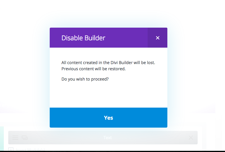
The second issue I found has to do with content lock in. Each builder has some form of content lock in, but Divi Builder is 100%.
At least they are nice enough to restore the original content. As we’ve seen with a very select few of the builders, avoiding content lock in is not impossible. Too bad so few achieve it.
Next, shortcode enclosures do not work across elements. You have probably noticed that this is a very common trend in builders.
Divi Builder is definitely not my least favorite of the builders but it’s far from my favorite as well.
Elementor
This was another new builder to me that came recommended by a few people on Twitter. Elementor is free on WordPress.org.
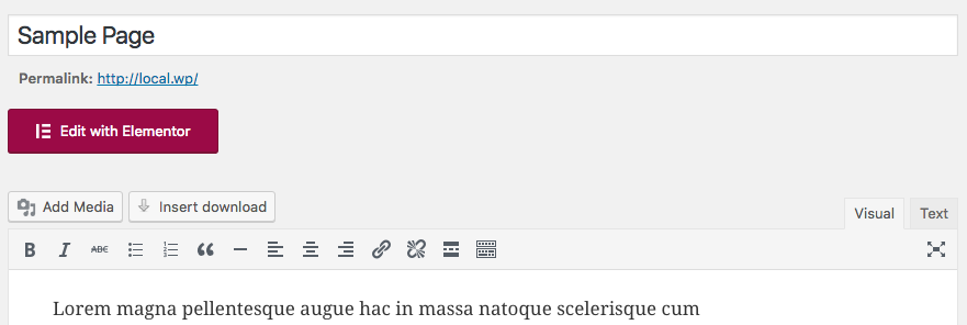
Like some of the others above, Elementor adds a large colored button to the edit screen. If you’ve read this far, you know my opinions on it.
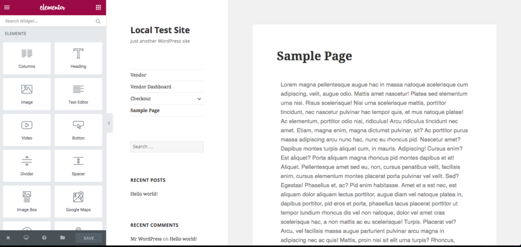
Clicking on it takes us to a frontend WYSIWYG editor, similar to the Customizer but with its own stylistic choices.
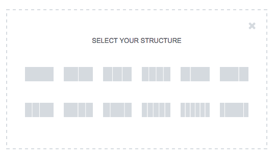
Adding new elements and widgets to the page is pretty nice and simple.
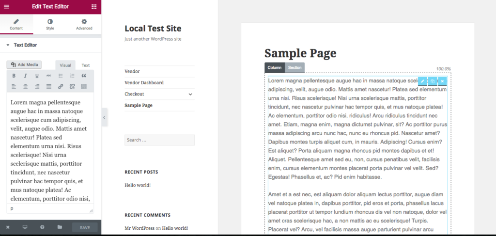
Overall, Elementor works quite nicely. There were a couple of weird quirks when editing the content of element blocks. Switching back to the element index wasn’t very intuitive, but clicking around a bit took care of it.
Aside from the big red button that I mentioned above, I only found two issues with Elementor, and they’re two of the same issues we’ve seen with most of the builders.
First, inline scripts loaded by shortcodes do not seem to work properly. The files simply do not get loaded when the shortcode that calls them is included inside a builder element.
Second, shortcode enclosures cannot be used across builder elements. Within individual elements they work fine, but trying to encapsulate multiple elements in a single shortcode breaks.
The builder is pretty nice but could use with a few improvements to make the editing experience smoother and to address the compatibility issues mentioned above.
Pootle Page Builder
A free plugin from WordPress.org with premium upgrades, Pootle Page Builder has crossed my radar a few times but this was my first opportunity to play with with it.
First, I just have to say their mascot makes me happy. That doesn’t mean much for how well the plugin will work, but it’s still a great touch.
Alright, let’s see what kind of monsters we’re dealing with in Pootle Page Builder.
After activation, users are presented with a nice welcome screen with helpful walk through videos. I skipped right past these but beginner users would very likely find them valuable.
On the page edit screen, we see a nicely placed Page Builder button.
The red doesn’t bother me too much here because it’s well placed with the existing Visual and Text button options. I do wish, however, that the button color would match the selected color scheme of the currently logged in user. That would be a nice touch.
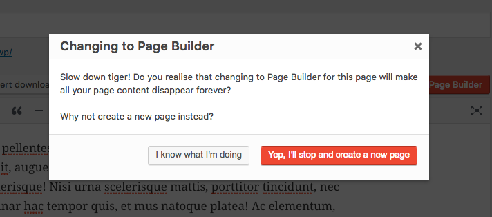
Clicking on the Page Builder button is where we see our first downside to the plugin.
Thankfully they warn us before deleting any content but I really do not feel this should be necessary. Page builders should always automatically pick up the existing content or, at minimum, provide a way to import the existing content. Some of the builders seen above support this properly.
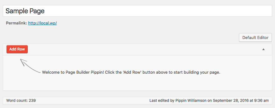
I went ahead and clicked I know what I’m doing and was presented with this:
I immediately noticed two things:
- At the bottom it shows Word count: 239
- The top right shows a Default Editor button
So I wondered what would happen if I clicked back to the default editor. Would my content be gone? Hurray! The content was still there. Pootle Page Builder did not delete my content, it was just being overly cautious to ensure the user knows that the content seen in the default editor is not the content seen in the page builder. While that could be improved to synchronize the two views, this was much better than I initially thought.
The builder interface was very straight forward and easy to use.
I was able to quickly add a multi-column row and add text elements to it. This all worked fine and displayed as expected on the frontend.
One thing that became immediately apparent about Pootle Page Builder is that it has a much more minimal approach to the builder concept than most plugins. Rather than offer builder elements for all different kinds of content types, it simply provides the tools to build a layout, in which users can then add whatever they wish from other plugins or their theme. I really like this. Far too many builder plugins go for the all-in-one approach that, while very valuable to many, result in a lot of bloat. A minimal plugin isn’t suited for everyone but for those that just want layout control, it’s perfect.
Aside from the issue I pointed out above with switching back and forth between the editor views, Pootle Page Builder only had two compatibility issues I could find.
First, shortcode enclosures do not work across elements, just like nearly all of the page builders above.
Second, inline scripts loaded by a shortcode do not appear to work, at least not in the scenarios that I tested.
If I was to use a page builder on one of my sites, Pootle Page Builder would be in the running for my top choice.
Live Composer
Another builder I was not aware of before this post, Live Composer is a free plugin on WordPress.org with free and premium add-on plugins. Based on the reviews and the active site count (more than 30,000), it seems Live Composer is quite popular and has a strong user base.
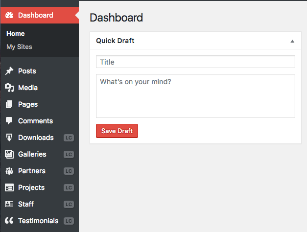
After activation, a welcome screen is show with information about upcoming add-ons and existing add-ons that can be used to extend the plugin’s functionality. I skipped right past this page and went straight to the page editor. Before I got there, however, I noticed that Live Composer and registered several new menus in my admin area:
That immediately told me that Live Composer is playing the all-in-one game and offering both content and layout creation. Personally I feel page builders should stick closer to the layout-only side.
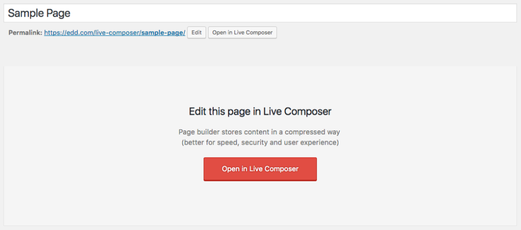
When we get to the page edit screen, we’re presented with a nicely done Open in Live Composer button that fits perfectly inside of WordPress’ UI.
Interestingly, the developers chose to add two buttons, one next to the page permalink and one called Page Builder next to the Visual and Text buttons. Both do the same thing and direct us to a frontend editor.
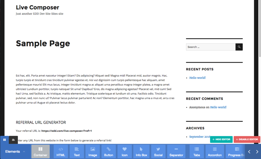
I really liked how well the developers integrated their editor into the page edit screen, but all of that happiness went down the drain when I saw this.
I personally dislike the color scheme of the builder, but that’s the smallest of the issues here. The biggest problem I see is that the builder interface becomes clumsy on anything less than a large screen. The builder elements are placed in a scrollable container without any quick way to find specific elements. The arrows on the right move the view port to the left and right but they’re incredibly slow. You’re forced to move the view port one click at a time. Most of the time, interfaces like this would allow the user to click and hold on the scroll bar to move quickly through the options, but not here. It only accepts single clicks, so if the element you need is 25 spaces to the right, you have to click at least 25 times to get there. Keyboard navigation is not an option either. This just screams accessibility (and usability) nightmare.
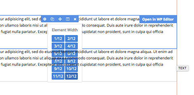
Once we get past the interface problems with adding elements, the builder itself works quite well. Adding new elements is pretty smooth and editing existing ones works nicely. There were some occasional quirks that caused issues, however. For example, I added a text field and then tried to split it into two columns. When doing this, the column controls went underneath the text element below it, making the column controls inaccessible.
Another example of poorly thought-out UI is the editor control panel for module rows. Again we are faced with a situation where there are a lot of controls to utilize, but they’re mostly hidden away in a scrollable horizontal container.
I spent some more time playing with the editor and found more of the same kind of issue so I decided to move on and test for the common compatibility problems. Here things broke down even further with five major compatibility problems.
First, the page builder completely ignores the existing content of the page. I’m really not sure why so many builders do this. It is not hard to import basic content in to a full-width text field and then let the site editor take it from there.
Second, shortcode enclosures do not work across columns and rows. I really wish page builder developers would spend more time ensuring compatibility for standard shortcode functionality.
Third, inline scripts loaded by shortcodes do not work at all. The scripts simply do not get loaded like they would in the standard WordPress editor.
Fourth, plugins that adjust content through the the_content filter break completely. Live Composer completely overrides the ability for plugins to adjust the page content, meaning the primarily functionality of plugins like Restrict Content Pro is completely useless when using Live Composer.
And last, if the page builder is deactivated, every bit of content put into the builder is lost. It’s 100% gone.
Considering the number of 5-star reviews and the high active site count for Live Composer, I was really expecting a very different experience.
Conclusions
I am jaded, I will not deny it. I’ve had too many poor experiences with page builder plugins to not have a bad taste in my mouth.
One of the main reasons I chose to do this review was to try and be objective about it to see if my opinion was justified. I am really, really happy to say that a few builders here have won over my complete support. Those include Tailor, Pootle Page Builder, and Beaver Builder. Those three are easily my favorites that I would happily recommend to any of my customers. Sure they each have a quirk or two of their own, but what product doesn’t?
After going through each of the plugins in this review, I feel there are a few items that builder plugin developers should work to address.
First, compatibility with standard shortcode functionality is a must. Unless a plugin’s purpose is to explicitly disable a piece of functionality, all native WordPress features should remain 100% functional.
Second, avoiding content lock in should be considered a top priority. WordPress has been built upon freedoms and the philosophy of owning your content. What good is content ownership if it’s lost due to a negligent plugin?
Third, I would love to see more builders give greater care to the playground in which they play. Respect native interfaces and design decisions and leverage them. Hands down the greatest user experiences will always be those that successfully blend functionality and interface design seamlessly into the environment in which they live (WordPress).
I would love page builders to be a consistently good tool for site owners to rely on, but in order for that to happen, there must be stronger compatibility with the wider plugin ecosystem. Not all of the builders are weak in this area, but the majority of them have at least one major weak point when it comes to plugin compatibility.
Let’s return now to the Tweet that started all of this:
I’m sorry is this hurts anyone feelings, but seriously, all of the majorly popular page builders for #WordPress are terrible.
— Pippin Williamson (@pippinsplugins) September 14, 2016
Are they all terrible? No, definitely not, some are even great! I hope that the opinions expressed here and the select compatibility issues pointed out help developers to create better page builders. I would be thrilled if this post was entirely obsolete in the near future.













Great review, and your criteria – especially the builder’s impact on content is a big factor to consider. However, I don’t think you adequately consider in your critique why page-builders are popular, and why in the end, a person chooses to use them, despite drawbacks. For small websites that are largely built of static content, or content that needs to be changed but by generally by a client with little development knowledge, the capabilities they offer are hard to pass up. They reduce costs, increase a baseline feature-set, standardize many plugins (sliders, carousels, etc), and make the future use of the site much easier. I’ll generally never use a page builder for blog posts, or any content that could eventually be 100s if not 1000s of pages, but for sub-30 page sites that often get fully rebuilt every 2-3 years, they are great.
I referenced it briefly when I mentioned Chris Lema’s article. His answer to that question is perfect: http://chrislema.com/want-wordpress-page-builders/
This is such a thorough and informative review…thank you!
Like you I can’t stand the builders and groan when I’m asked to go help with a client’s site and one of those builders are installed. I am one of those purists who only builds sites in Genesis and who is constantly talking about the perils and pitfalls of some of those fully-loaded themes used with the dreaded builder plugins.
This has made me a tad unpopular on the boards… I am looking forward to sharing your very objective piece with clients and prospects.
Excellent review!
I’d like to know more about accessibility of the resulting public facing pages produced by each page builder. For example comparing the results using the WAVE tool (http://wave.webaim.org/) could be an interesting exercise. I’ve seen reports that suggest 15% of visitors are in need of accessibility support and should be better accommodated by better website design. In some cases /countries it’s the law.
Master level review, Pippin. Thanks for the time and effort. Solid, solid stuff.
I feel that the Conclusion section of this review needs a better summary for the people that don’t have time to read the entire thing.
>”…some are even great”
Great. Which ones made you think that?
Which one would you use if you HAD TO use one?
Thanks for the feedback! I thought about it but deliberately chose not to include a TL;DR.
When making decisions about your website, especially if it is a business site, you should not be basing those decisions off of a summary at the end of a review. If it’s an important piece of your site, read the whole thing to ensure you’re making an informed decision based on the information provided.
Also the conclusion did include my three favorites 😉
I know you said you didn’t have time to review all page builders, but I was wondering if Cornerstone came across your radar or if you’ve heard of it before? (This one: http://theme.co/cornerstone/)
It’s one that I’ve used a lot and found to blend well with the WordPress UI. Just curious to know your thoughts, thanks!
I, too, was a little surprised to see this one didn’t make the list. Perhaps because it originated within a single theme (“X”) and is still becoming better known.
I’ve not used any but one of these other builders, so my personal experience is limited. But I find Cornerstone to be quite good.
How do I discover the “content lock” of a particular page builder? I’m specifically wondering about Headway.
Easiest way is to simply deactivate the theme or plugin and then see which content disappears. If any content goes away, there is content lock in.
I’d wondered what would happen to the page builder landscape if a basic builder was included into the WordPress core?
I did a roundup list of builders a few years back when it was an even wilder west that included things like “Post Builders” ( badcat.com/journal/wordpress-page-builders/ ) — and at the end I’d come to the conclusion that, in the same way that WooNav had ultimately been included into WordPress, it might be an overall better experience to have a core-based builder that can be expanded rather than an every-man-for-themselves approach when altering people’s content just for the sake of layout.
Think it’ll ever happen?
I don’t think it’s likely anytime in the immediate future.
Thanks for this very thorough review. I’m not an especially big fan of page builders, but I do see the place for them. It’s good to know that some, at least, are good from many perspectives.
Great post as usual, Pippin. I totally understand your angst with builder plugins. They are by far the biggest support headache for me as well so I feel your pain.
Amen!
This has amused me no end. I like pippin, he offers uber fantastic support – but guess what – he is a multi talented, phenomenal programmer – I’m still astounded at the amount of Developers who want a dev version of a page builder – so what they don’t play well with shortcodes or the css is too strong. Guess what developers – page Builders are not made for you – you are developers, you should know what you are doing so you don’t need a page builder, you are not the demographic – useful as they are – page builders will never ever, replace the developer who knows what they are doing – As developers you will need to learn the ins and outs of some page builders in order to be able to fix user errors – great – another earning opportunity. Page builders are great – they have opened up a whole new world to the diyer, they have also opened up a whole new eco system built around child themes that have added extras – carry on page builder developers – you’re doing a great job.
Well said Andrew!
Horses for courses.
My background is of 25 years as a graphic designer, mainly for print but over the last 5-8 years covering digital as well.
As advised from posts for years, I limit the amount of plugins I use with my builder (I did pay an obscene amount on plugins in the early days to get all the bells and whistles – though now I feel less is certainly more), and it works sweet with my blank base/child theme.
I go to a few WordPress meet ups and listen the devs working for larger agencies go on about the art of understanding WP, I swear they make life hard for themselves on purpose. Visually the sample sites they share in lectures do not engage or hold my attention – though they are devs and not designers (maybe a post for another time).
With my builder and my blank theme, all aspects of responsiveness are taken care of as well as understandably all my (client) sites have to work seamlessly on all devices. And guess what, if I have any issues along the way the author/dev of my page builder is only a skype call away to guide me through all that is the black art of WP.
Finally, after all the design and layout, seo etc is completed, the sites go live on my super fast cloud server via Cloudways – job done!!
I used to hear that same argument against Dreamweaver from devs…….
Sounds like page builders are perfect for you and that’s wonderful! My intention was not to discourage people from using builders but rather to highlight some of the current issues that affect both developers and end users so that builders can be made even better.
Critical analysis is how products get improved.
Andrew,
You’re absolutely right; page builders are not built for developers, nor did I ever try to say they were 🙂
There are two primary issues highlighted in these reviews:
1. There are significant compatibility issues between most page builders and other plugins. While these are problems for developers to discuss and work on, they very much effect end users.
2. There are design flaws with many page builders that have significantly negative effects on end users, such as content lock in.
In no way am I trying to discourage people from using page builders nor am I trying to discourage developers from building them. Very much on the contrary. I chose to write this review as a means to highlight some of the problems we currently have with page builders hoping that those developers that choose to create builders recognize the current issues and work to improve them.
Products don’t ever get better by people saying “it’s perfect” or “it’s wonderful”. Products get better by critically analyzing them and identifying problems. That’s what I have tried to do here in an effort to make them better.
I absolutely get that and the frustrations I have with page builders are the same as highlighted here – its a question of evolution. Writing in Notepad is how I learnt, the transition to a CMS (home made) was fantastic and page builders are what my business is built on – and of course – soon to be EDD so I trust your judgement and your products – but, I am always a little sceptical when Devs do a comparison – I think I may even sponsor a 10 non dev user focus group on page builders – it would be interesting to see the results. 🙂
Sounds like a great idea!
I don’t think the point was finding a “page builder for developers”, rather finding a page builder that doesn’t frustrate developers and site owners alike.
While I’d love a “dev version of a page builder” (Beaver Builder comes closest), I first just want one that doesn’t break standards left and right. Page Builder not playing well with core features like shortcodes and filters _is_ a real problem for site owners, not just developers, since they’re the ones that end up hitting those conflicts.
I am sorry you had to take the time to research this. I have had so may people hire me to make their WP site do this and that and they have those blasted page builders. You didn’t need to convince me but I am not sure you will convince the masses who keep buying the themes with page builders!
Hi Pippin,
did you test Divi Builder 3.0. Or the older one? It would help us to know, if we have to change to Beaver Builder. the free Builders are nice, but how will guarantee of the development? thanks for your testing
I tested the currently available one.
Clearly you didn’t spend much time with Divi Pippin and clearly you spent ZERO time with the front-end editor.
Divi has a steep learning curve (although the new front-end editor is pretty simple to use) but is worth every second of it. Do you need to know CSS really well to take advantage of the power of it? Absolutely!
Your thoughts on back end color and design are irrelevant to the actual operation of it. Why allow your bias into the review?
Sounds more like a hacked up review by a pissed off script kiddie that is pissed cause he didn’t think of any of these first.
Hi Pippin,
it’s Simone here, one of the two creators of Brix Builder.
First of all, thank you so much for taking the time in reviewing our plugin; constructive criticism is what makes products and businesses grow, and we really appreciated that in your review!
Regarding one of your observations, what you say is true: when using Brix, you are either creating content with it, or you keep it out of the frame, and keep creating in the regular WordPress editor.
Switching back to the regular WordPress editor is possible, and while doing so Brix layout is preserved, but new content added in the editor isn’t transferred in Brix.
We just wanted to explain our choice here: one way to keep editability on both sides could have been to print markup directly in the editor, however we didn’t feel like doing it, because one typo is enough for the whole structure to fail, and we wanted to keep things as simple as possible.
We recognize that other builders might have followed that approach, and also that some users could see that as a critical missing feature, but one would still have a TinyMCE editor in our text content blocks.
Concerning the other issues you mentioned, we are going to release an update to our plugin tomorrow that will add support for shortcode enclosures.
Also, we’ve corrected how we hook into
the_contentfor display: this way, other plugins will be able to hook either before or after the content generated by Brix, just like they’d do normally.We thank you so much for reporting these issues, by the way, as they’re indeed critical: we don’t want to waste your time, but once the update is out, could we ask you to give feedback about them? 🙂 We’d really appreciate it!
In closing, thanks for your kind words too: we really put our hearts in trying to create something whose UI and UX were the best that we could.
We want to create something usable, compatible, and – why not – fun too: our plugin is fairly young, we’ll definitely improve the installation process and the core experience, and of course the issues you noticed won’t be the last ones that we fix, but we think Brix is a promising piece of software, and criticism like yours can only do good for it.
Simone & Andrea
Thanks for reaching out! That makes me very happy to hear about the updates 🙂
Having only just discovered your builder through this review, I’m curious (as it wouldn’t appear to be in your site FAQ) how Brix is licensed for sale. Is it governed by a GPL, Proprietary, Split License, etc?
Hi Matt,
Brix is licensed under the GPL, we’ll make sure to add this info to the f.a.q. 😉
What about Optimize Press 2? it is born as a theme, but now is a plugin, too
easy and super compatible with EDD
I will try and take a look at it. As there are so many different builders, I had to put a limit somewhere.
Great review and THANKS for all the hard work. I know that Toolset is not a stand alone builder, but i’d really like to get your opinion on that.
HI Pippin,
Thanks for the in depth reviews of so many page builders!
I was wondering if you could elaborate on the lock-in aspect of Elementor and Pootle Page builder. You didn’t mention anything about that aspect considering these plugins so I guess it’s fine but I’d like to know for sure.
And to others, I’m a developer who delivers WordPress with page builders. I tend to create widgets/elements for Visual Composer for example so they exactly match what a designer has designed. So I’m blessed with these reviews. The only thing I still need to find out is how well these page builders can be customized and if they can be extended with widgets/elements.
Thanks again Pippin!
Hi Tomas,
Content lock in wasn’t mentioned with Pootle Pagebuilder in Pippin’s review – Pootle Pagebuilder doesn’t lock in content 🙂
Thanks so much for a great read, I just wanted to way in as a developer. I have opted to use site origin’s page builder (SOPB) because it doesnt enqueue any additional external CSS or JS (well at least just as a layout editor), some of these page builders can load up to 300kB of assets sometimes more. SOPB inlines css so very little overhead because it only inlines what it needs, for example if you have a 2 column layout it will only inline styles for the 2 columns not 3,4,5,6 column layouts.
What we really need is for wordpress to make core some of these features, live editing and layouts.
I think you meant “weigh” rather than “way” and may also have meant “designer” instead of “developer” judging by the rest of your post. My apologies otherwise.
Anyhow, I hope to never see such features actually added to core. One of WP’s strengths comes from it’s modular / extensible nature. The more that the WP team forgets this and bloats the core with features that can’t be easily disabled, the less performant and popular it will eventually become. Such features should never exist outside an official plugin. Let them add it to the Jetpack if they want.
Thanks for taking the time, Pippin. A hugely valuable perspective.
Thanks for this post, Pippin. Really, wow, there was a lot of info in there!
IMHO, content lock in is something I’ll never tolerate. So Pootle is out for me, but Tailor looks the most tempting alternative to BeaverBuilder (the one and only I’ve ever been happy with). Tailor being shortcode based bothers me. I really think shortcodes have no business being used for page builder layouts.
Hey there jb510!
If you’re open to page builders which uses not-aligned-to-WordPress-color-scheme, Pippin mentioned about Page Builder Sandwich in the list if you’re looking for a page builder that uses no shortcodes and does not lock you in.
Hi jb510, we don’t actually lock in content with Pootle Pagebuilder 🙂
Pippin was talking about switching between views 🙂
One cup of coffee later I am very fond of having read your extensive and informative post. Thanks a lot for your maximum effort here. And kudos for conquering your page builder demons ;).
Hi Pippin,
thanks for the great review of Visual Composer. We can’t fully agree with following the native way of UI/UX of WP, as from our perspective we must teach our customers that page builder is an addition to WordPress and as you said, it is, of course, the diversity of views. 🙂
The case with content locking and shortcodes goes hand in hand. Initially, the shortcode idea was chosen because of the native way of how WordPress works. The good news is that we are working on resolving content locking and once we’ll be ready would love to hear your thoughts on Visual Composer, as it seems you really have a good understanding and ideology on how page builders should work in general.
Thanks once again for the great and huge job you’ve done there.
Glad to hear it’s being worked on!
Hi Pippin, wanted to drop a quick message that new Visual Composer Website Builder is live at visualcomposer.io so probably you want to check it out. The Premium version will come out in December, but still free version is worth checking out 🙂
Hold on. Has Visual Composer finally left Envato or gone non exclusive? Will the premium be sold, updated and supported solely through your site?
Wonderful! Is it going to be exclusively available on your site or will it still be on Code Canyon as well?
Having now visited the site, downloaded free version of the plugin offered there and inspected it…
The plugin author details clearly show they are not WPBakery but instead Visual Composer Team. The company listed would appear to be based in India instead. This may explain why the URL is not the real wpbakery.com but visualcomposer.io
So my feeling is that it’s a potentially illegitimate and/or immortal fork of Visual Composer by an unaffiliated 3rd party author using the branding without permission in order to cash in on the success of the original real plugin.
Matt, it is legitimate. Raitis Sevelis’s email is a @wpbakery.com domain. It just shows a brand pivot, which is likely a very smart move as everyone knows the Visual Composer brand.
That’s great to hear and I’m very happy to be wrong here. Sorry for being overly skeptical as I’m sometimes too overprotective of the WP Community.
Excellent review – and thank you for taking the time to provide such thorough examination. You’re a trooper – now, go get yourself a beer and put your feet up!
Thanks so much for the awesome review.
Amidst the hard-selling affiliates it becomes very difficult to find genuine reviews.
The other day, we were trying to find a premium responsive theme with proper schema markup and SEO and believe me it is very hard to find one!
Almost everyone theme shop is hell bent on selling you page-builder integrated theme. Then there are few who would forget about a theme after releasing it.
It will be great if you can come up with a similar review for WordPress free and commercial themes.
I’ve been using Visual Composer and I love it. I know the shortcodes would stay if you deactivate the plugin but, why would you do that? you installed it because you want to use it. What I like about it the best is, the shortcodes. Sometimes I want to grab elements from one page and elements from another to create a third page but I don’t want to spend time setting them up again, so I use the shortcodes. I am used to them so I can easy identify what I need, copy the shortcode, paste it in this new page and voila!, my element is already set up. I also like that there is an ability to save/create presets of each element, for example, I set up a title with colors, sizes, spacings, margins, etc for the whole website so I save it as a preset as “main title”, then when I call the Title block I just choose that preset and all my settings are there.
I’m glad to hear it works well for you!
It might be surprising but people switch plugins all the time. Sometimes it’s because they’re testing our various options and sometimes it’s for other reasons, perhaps an issue was found and they need a different option.
This is a great review, possibly the most comprehensive one that I’ve seen so far. However can I make a few suggestions? Subheadings would be nice, a navigation pane on the side of the right sidebar would be amazing, and some kind of chart or comparison at the end – all these would really make it much easier to navigate and process all the useful information you have presented!
Pootle Pagebuilder (plugin author)
Thanks for leaving such a positive review Pippin. As one of the young and hungry but less well know pagebuilders it really helps spread the word about Pootle Pagebuilder. Our philosophy at Pootle is to keep things lean, fast and open so that users can leverage the existing WordPress ecosystem. And it’s great to see this being recognised. So a big thank you 🙂
Awesome review, Pippin. Hats off to you. I’ve been trying Visual Composer and Site Origin page builders only, but the experience is not too good. I totally agree with you about the content locking, which is a major issue. The problem with “the_content” filter sounds interesting as I haven’t met it before. But happy to know it exists.
Again, this is a wonderful review and thanks a lot for sharing your objective opinions!
First of all, let me say you should be paid for this thorough assessment of 13! different page builders. It seems to me that it only lacks the performance aspect.
You did a clear and fair assessment of the essential points, and this is really helpful when having to deal with the problem of choosing a page builder due to project constraints (I’m sure this is quite common).
There’re some kind of page builders that, I guess, could also be helpful (and specially) for developers and not targetted on end-users. I could see Mesh on this list, and WDS Simple Page Builder. This are very different approaches to page builders, and not focused on content or bells and whistles.