Before starting this, I need to be completely honest: I really dislike page builders. In the last few years, page builder plugins (and those built into themes) have quite possibly caused more headaches for me and my support team than any other single category of plugins available for WordPress. This overall experience, and one too many support tickets related to a builder in a week, culminated in the following Twitter rant:
I’m sorry is this hurts anyone feelings, but seriously, all of the majorly popular page builders for #WordPress are terrible.
— Pippin Williamson (@pippinsplugins) September 14, 2016
Not only do they typically have incredibly subpar user experiences, they are easily the biggest compatibility problem for other plugins
— Pippin Williamson (@pippinsplugins) September 14, 2016
The sheer number of tickets that would NOT land in my system every week if they weren’t a thing is crazy.
— Pippin Williamson (@pippinsplugins) September 14, 2016
They break other plugins every day through their incredibly non-standard methods of content “building"
— Pippin Williamson (@pippinsplugins) September 14, 2016
I’m all for a good page builder, but if that means screwing over compatibility with other plugins’ ability to use standard WP features, stop
— Pippin Williamson (@pippinsplugins) September 14, 2016
These tweets garnered a fair amount of attention in the form of agreements, questions, and denial. Throughout the various small conversations that followed, I began to realize that I had never once truly used any of the page builder plugins that I was moaning about. Sure I had seem them countless times in our support system–usually in a negative light–but I hadn’t actually used one.
With that realization, it only seemed right that I take the time to truly try each one and give them a full review, so here we are.
Why page builders exist
There are many different answers to the question of “why?” but I think they can generally be summed up to this: people want them.
As much as they often cause difficulties for me and my team, I cannot deny that page builders have a huge audience of eager customers. Clearly they exist and thrive because the market demands them.
Chris Lema answered “why?” well in his recent blog post:
Simple. They offer customers a solution for personalization that mass-produced themes can’t offer, while at a lower price than working with a professional web developer and web designer.
I cannot argue with the utilitarian and economical purpose of page builders. I do feel, however, that page builders currently pose a severe problem to the WordPress ecosystem. They have become so ubiquitous that many site owners do not even realize that page builders are not part of WordPress.
On one hand this is great! It clearly shows value and demand for page builders. On the other hand, however, it can be detrimental to the overall WordPress project and user experience.
The problem with page builders
Last week I had a customer open a support ticket and say that the interface shown in our getting started videos did not match what he was seeing. At first I figured this was simply due to the natural progression of user interfaces overtime. We had made some changes recently so some of the options shown had different labels, different appearances, etc. What I discovered, however, was that the “difference” he was seeing was due to a popular page builder plugin. His edit screen had a visual page builder. Our getting started video did not. His sole experience with WordPress began with a theme that included a page builder, making him naturally believe that was the standard for all WordPress sites.
There are several prominent themes for WordPress that have a huge market share. Because of the sheer scale of their market share, these themes have extraordinary power to influence the expectations of a sizable percentage of WordPress users. When these players introduce extensive page builders, and other non-standard features, it is easy for their user base, who are typically non-power users of WordPress, to obtain a skewed perspective of what is “default” in WordPress.
I do not intend to say that we shouldn’t be influencing “default” perspectives–doing that is how we push forward improvements–but I do firmly believe that the creators of these page builders have a responsibility to be very careful. Unfortunately these themes, and the associated page builders, are not particularly known for incredibly high quality products or for actively participating in development of WordPress itself. This is not typically a direct concern for non-power users, but it does greatly affect them when these products result in problems with other WordPress products.
The page builder ecosystem is a wild west right now and is in a gold rush. A lot of different players are building their own versions and many are reaping good rewards for their efforts. I am all for teams building solid products and being rewarded for their efforts.
What the page builder industry is severely lacking is standardization. There is zero standard to how page builders should work. This shouldn’t surprise anyone as this is exactly what happens in every ecosystem that experiences a gold rush. Just look back a year or three to the commercial theme industry to see an excellent example of this. Thankfully these lacking standards tend to work themselves out as products mature.
In any large ecosystem where developers are free to build their own visions of products and openly offer those to the world, it should be expected to have a lot of variation. It is the incredible diversity in page builders that I believe is one of the primary sources of problems right now.
Okay enough of that, let’s get into the reviews.
The review process
For this review process, I felt there were several important factors that needed to be looked at for each of the plugins:
- How easy are they to use.
- How well do the builder interfaces translate into the final presentation.
- How much do they lock users into the system once used? Does the content display properly if the builder is deactivated? Does the content even exist after deactivating the plugin?
- Can filters such as the_content still be used to affect the final page content? This is incredibly important for compatibility with many other plugins.
- Are there any compatibility issues with frequently used methods in plugins (such as we see in our support systems)?
While not a super definitive list, I felt that these five criteria provided a fairly robust baseline for judging each plugin. With each plugin being different and them each offering their own unique feature set, I opted not to judge any of the plugins on the features they had or didn’t have and, instead, judged purely based on these five points.
In reviewing these plugins, it would be very easy to fall into a rabbit hole and spend hours upon hours setting up test sites and building sample page layouts. It may seem counter-productive to review page builders and not test building extensive layouts, but I really wanted to cover the basics and identify each plugin that suffered from or caused some of the common compatibility issues we see.
For each plugin, I did the following:
- Activated the plugin in a fresh install using a default theme without any other plugins active.
- Obtained a quick opinion of the overall interface of the plugin. Does it clash with standard WordPress interfaces? Is it obtrusive? Does it flow and feel natural?
- Tested the builder on the default Sample Page created by WordPress to get a quick feel for the overall interface and feature set of the plugin. This included using the builder to create a quick layout with several different elements to confirm the builder displayed properly in the default WordPress theme. As surprising as it might be, there are a huge number of plugins that display poorly in the default themes so this is always one of my first tests. If the plugin doesn’t work well in a default theme, how can we expect it to work well in other themes?
- From the edit screen of the Sample Page, I toggled the builder interface on and off in order to ascertain how well the builder supported using the standard WordPress editor and the builder simultaneously.
- Deactivated the builder plugin and then re-visited the Sample Page to determine what extent of content-loss deactivating the plugin caused. Ideally there should be zero content lost.
- Activated AffiliateWP, AffiliateWP – Affiliate Area Shortcodes, and Restrict Content Pro and then tested some of the features within these plugins that were known to fail frequently with page builders. I chose these plugins because I am intimately familiar with them, am aware of several compatibility issues with page builders, and I know that I have already taken serious effort to resolve many compatibility issues.
- Wrote down quick notes for each plugin for “good” and “bad” items based on the steps outlined here.
Common compatibility issues
In our support queues, we see several common problems with page builders, each of which I wanted to test for in this review.
First, we see a lot of cases where inline scripts loaded in a shortcode fail. For example, our [register_form] shortcode in Restrict Content Pro conditionally loads javascript and CSS files on the page the shortcode is included on. We sometimes see the files fail to load due to the way the builder plugins modify the content of the page, which breaks some of the standard WordPress shortcode detection methods, such as has_shortcode().
Second, we see site owners often try and use opening and closing shortcodes across page builder elements. This is common with the restrict shortcode in Restrict Content Pro. A lot of page builders are not able to adequately support opening and closing shortcodes when they are placed in different rows or columns in the builder.
Third, we see a lot of cases where plugins, such as Restrict Content Pro, are unable the modify the page content through the the_content filter when a page builder is used. As filtering the content is an incredibly common thing for plugins to do, I wanted to thoroughly test this with each page builder.
Fourth, we see frequent instances where page builders mess with content formatting of shortcodes added to builder elements. For example, some builders will cause extra paragraph tags to be added around HTML output by a shortcode, resulting in very poor frontend display of the shortcode that is completely different from what it would be if added directly to a page not using a builder.
The plugins reviewed
When I first started working on this, I planned to review all page builders, including those built into themes, but I backtracked on that idea once I realized judging a theme-specific page builder against a theme-agnostic page builder made as a plugin was not a fair nor accurate comparison. It’s for this reason that Make, Headway, Layers, and some others are not included.
I originally planned to review only the builder plugins I was aware of (typically those that cause problems in our support queues) but then opted to review as many as I could find in order to be as pragmatic as possible. Perhaps some of the builder plugins never made appearances in our support queues because they were awesome and didn’t cause any problems.
With the sheer number of plugins available, I know for a fact that I was not able to include every page builder plugin, but I do believe I managed a fairly extensive list that includes all of the most prominent players in the market.
Here are the plugins included in this review:
- Beaver Builder
- Visual Composer
- Tailor
- Fusion Builder
- Divi Builder
- Thrive Themes Content Builder
- PageBuilderSandwich
- Brix Builder
- Conductor
- Site Origin Page Builder
- Elementor
- Pootle Page Builder
- Live Composer
I feel it is important to mention that the reviews and opinions expressed here are solely my own. No sponsorships were requested or accepted for these reviews and the license costs for all plugins (when necessary) was paid in full from my own pocket.
There are no affiliate links on this page.
Alrighty, let’s get on to the actual reviews!
Beaver Builder
Over the last few years I’ve heard nothing but great things about Beaver Builder. It is a commercial plugin that constantly gets great reviews and has been doing very well on the commercial front. I’ve read many of the reviews of the plugin over time but this was my first opportunity to use it.
I am a firm believer in first impressions. The good news for Beaver Builder is that they have a strong reputation as a high quality product, leading me to have good expectations for it. Unfortunately for Beaver Builder, my first experience with it was immediately tarnished by this:
I had purchased a Standard license, which, as it turns out, does not include support for WordPress multisite. I have found multisite to be one of the greatest assets in quickly spinning up fresh WordPress sites for testing. I understand that this limitation was done intentionally to prevent customers from activating the plugin on numerous sites within a single network, but the user experience here was quite poor.
Being a developer, I said “like hell I can’t use it on multisite” and quickly found the logic inside of the plugin, removed it, and went on with testing.
Thankfully, the rest of my experience with Beaver Builder was much better than my first impression.
Upon loading the page edit screen, I was pleased to see a clean, unobtrusive interface. Too many page builders include massive, colorful buttons that just stick out like a sore thumb. Beaver Builder added theirs in a nice, tasteful manner.
Clicking on Page Builder takes the user into a front-end interface that feels relatively similar to the customizer.
The overall interface of the builder was pretty intuitive and worked well. I especially liked that it all felt pretty native to WordPress.
I went ahead and used the builder to create a few simple layouts and each worked well. I then proceeded to test the plugin with the steps outlined above in the review process.
Overall, very few problems were found and none of the common compatibility issues I detailed above appeared to be present in Beaver Builder. This is very good so far.
One of the great things about Beaver Builder is how well it retains content when switching the page builder off or deactivating the plugin. Retaining content is incredibly important for a good user experience. Imagine the anguish it could cause if a user was to construct an extensive page, decide to use a different builder, and then discovered that all of the content placed within the builder was lost completely when it was switched off.
I did, however, find a few pain points that I would like to mention. Some of these are not inherently bad, but, depending on the scenario, could result in unpleasant user experiences.
My first criticism for the plugin has already been mentioned, and that is the lack of support for WordPress multisite in the standard license. I’m entirely fine with limiting the number of domains the plugin is activated on but this limitation should not affect my ability to use a core WordPress feature.
Second, I found that a large number of the builder elements, such as contact forms, are not retained when the plugin is deactivated. This is because Beaver Builder includes its own proprietary contact forms, testimonial blocks, subscribe forms, image sliders, and many other content types. While it makes perfect sense to include these, it is important that users be aware of how they will be locked into using Beaver Builder once opting to add these kind of elements to their pages. This is where the separation between layout building and content creation becomes very blurry.
Third, Beaver Builder makes heavy use of icons through out its interface. Inherently icons are not bad, but when not combined with proper labels, icons can be disastrous for accessibility and are, overall, not very intuitive. In numerous cases it took trial and error for me to figure out exactly what each icon used did.
Overall, I was very pleased with Beaver Builder, especially as it did not present any of our known compatibility issues.
Visual Composer
Perhaps one of the most widely used page builders, Visual Composer is a commercial plugin created by WPBakery and is available from Code Canyon.net. Aside from being one of the earliest page builders, a large part of its popularity comes from it being bundled in a huge number of commercial themes on Theme Forest.net.
On one hand, Visual Composer has been perhaps one of the most challenging for me and my support team as it has had frequent compatibility issues with our plugins and others. Yet on the other hand, Visual Composer is also very good at building plugin-specific add-ons that add feature sets for other popular plugins, especially eCommerce plugins.
When activated, Visual Composer adds a large blue block with several buttons to the top of the edit screen. This block provides toggles for enabling the visual editor, classic mode (default WordPress), and a frontend editor.
I don’t particular care for the obtrusive format or style of these buttons. They just feel unnatural and are too much “in your face”.
Once enabled, the visual builder is pretty intuitive.
There are a few things I like about this interface. First, the icons, while still a bit too heavily used, are simple and have pretty clear meanings. Second, the interface does not feel cramped. Even though there is a lot going on, everything still has space to breath. It’s quite well laid out.
From a user perspective, it is nice to get a pretty accurate What-You-See-Is-What-You-Get view. The developers at WPBakery have done a good job with the drag-and-drop aspects of the builder as well. Too often drag-and-drop interfaces end up being choppy and jagged, but the one in Visual Composer is pretty smooth and works reliably.
In the same vein as a good WYSIWYG on the backend, Visual Composer also provides a complete frontend editing interface that truly is a WYSIWYG experience.
When strictly using the visual editors, the Visual Composer experience is quite good. I don’t personally care for much of the stylistic decisions made with the Visual Composer interface as they really don’t blend well with native WordPress interfaces, but that’s largely just personal preference.
It is an overly broad generalization, but I’ve found that most developers that do not take the time to blend their own interfaces with the native WordPress interface, do not typically have great care for the overall user experience nor do they care greatly for WordPress itself. I cannot say if this holds true for the Visual Composer developers and, like I said, it is a very broad generalization, but it’s one I’ve found to be pretty accurate in my own experiences. It is one thing to strike out against standard user interfaces in order to create something better, and it is entirely something else to go drastically against style choices simply for the sake of it.
Along with my own personal distaste for the lack of style continuity in Visual Composer, there are two primary issues I found with it.
First, Visual Composer has a really, really strong lock-in effect due to its use of shortcodes for layout construction. Here’s a screenshot of the page editor after switching back to Classic editing mode (default WordPress):
Notice all the shortcodes? For this screenshot, I built a very simple page with three rows and two columns. For that, three separate shortcodes were added to the page in order to create the layout. Now imagine a much more advanced layout that includes numerous columns, many rows, and a lot of other builder elements, such as buttons, contact forms, images, etc. The sheer number of shortcodes added to the page makes it nearly impossible to comfortably edit the page in the classic editor. For anyone that wishes or needs to switch back and forth between editing modes, this is a very poor experience.
The heavy use of shortcodes also makes it a serious chore to ever disable Visual Composer and use something else, even just default WordPress. The site editors would be required to go through and remove the countless shortcodes from every single page that Visual Composer ever touched.
Non-technical users may not care how it works behind the scenes, but they will care about the amount of work removing Visual Composer if that ever become necessary.
The second issue I found is one of the common compatibility issues I mentioned above related to shortcodes.
Opening and closing shortcodes work properly within individual elements but they do not work across elements. Take the following screenshot as an example.
The edit window is editing the contents of the very first row. You can see I added a [] shortcode to it. At the bottom of the screenshot, you can see the closing [] shortcode. We’ve found this to be a very common practice with these kinds of shortcodes because site owners want to restrict a portion of the page while still retaining control of the layout within the shortcodes.
When rendered, the shortcode parsing breaks as shown in this screenshot:
Visual Composer has some really nice aspects to it and is overall a very well functioning page builder, but I would personally avoid it due to the severe lock-in effect.
Tailor
This was a page builder I had not heard of until several people recommended it in response to my Twitter posts. It is available for free on WordPress.org and is built by Andrew Worsfold.
After activating Tailor, one of the very first things that caught my eye was the level of care with which Andrew integrated his plugin’s interface with the native WordPress UI.
It looks and feels exactly like native WordPress. I love that. It uses a Customizer-like interface that gets out of the way while still being very intuitive.
Another positive note for Tailor is the lack of icons for actionable items, making it easier for a site editor to quickly understand what each option does.
One of the few “complaints” I’ve found from other users of Tailor is that it’s not as feature rich as many of the other builders. After thinking about this for a while, I’ve decided that the fewer features offered by Tailor is actually a hugely positive note for the plugin. So often people get caught up on whether a plugin has tons of features or is an all-in-one package without stopping to think if the plugin should offer those features.
Many of the other page builder plugins include options for contact forms, testimonials, post sliders, and so much more. Tailor offers a few of those items but it distinctly limits them to a few more basic ones. Personally I really like this because I don’t believe page builders should be providing contact forms and other major feature sets. A builder should be for creating layouts, not handling email submissions. Those features should be handled through other plugins, such as a real form builder or image slider plugin, and then simply added to and displayed within the page builder’s layout.
Tailor walks the fine line between layout building and content creation / collection very well.
Another thing Tailor does well is content retention when the plugin is deactivated. None of the content is lost. It also has a really excellent admin-side representation of the frontend layout, giving it a great WYSIWYG experience.
There were only two negatives I found with Tailor, one being a compatibility issue and one just being a minor quirk.
First, shortcode openings and closures do not work properly across rows and columns. Look at my first screenshot above and you’ll see at the bottom. The first content block has the opening shortcode.
The second problem is simply that the drag-and-drop is sometimes a little rough. Elements tend to jump around a bit while trying to place a new one on the page. This is pretty minor but a smoother drag-and-drop would be excellent.
Overall, Tailor is a really excellent page builder that I would not hesitate to recommend to users.
Thrive Visual Editor
The Thrive Visual Editor plugin is built by Thrive Themes but is theme-agnostic, so it works with more than just their own themes. It is a commercial plugin that seems to have a pretty large customer base.
I’ve run into Thrive Visual Editor numerous times in our customer support channels but have not had any real experience with it before purchasing a license to test for this review.
The first thing I notice about the builder is it’s pretty reserved in how it adds its interface to the edit page screen. It’s not perfectly smooth and does stick about a bit, but it’s much more minimal than many of the other builder plugins.
Clicking on the Edit with Thrive Content Builder button takes us to a new, frontend builder that looks like this:
Hovering over an element on the page shows an outline with three options: drag-and-drop ordering, duplicate, and close.
I rather like this because it stays away from abundant, hard-to-grok icons.
Adding new elements to the page is quick and quite intuitive. I really like the interface they’ve created for adding column layouts. Instead of using weird icons or other mechanisms for controlling the number of columns, they simply give you options for each division option:
It’s simple and intuitive. While all page builders strive to build an intuitive layout builder, I think Thrive Visual Editor has possibly done it the best of all, or very close to it.
There is really only one problem I found with the plugin. Shortcode parsing works, script loading works, everything works great in fact, but there is one major issue that, for me at least, is serious.
The Thrive Visual Editor plugin has 100% content lock in. Let’s compare the admin edit screen to the frontend edit screen for the same page.
Admin:
Frontend:
Notice the difference? None of the content added through the visual editor is shown in the admin. Instead of working with the existing page content, Thrive Visual Editor simply overwrites the page content. That also means that if you deactivate the plugin, all of the content added through the plugin is gone. Poof, vanished.
All page builders should strive to retain as much standard behavior as possible. Unfortunately, Thrive Visual Editor fails badly here, which is really too bad because if they had avoided the complete content lock-in, this would be one of the best page builders available. Unlike nearly all of the other page builders, Thrive Visual Editor does not suffer from a single common conflict that I could find, but the content lock-in is dangerous. For that reason alone, I would avoid using the plugin.
Fusion Builder
Fusion is the page builder from Theme Fusion, the creators of the notoriously popular Avada theme. It is quite possibly one of the most wide spread page builders due to its inclusion in the Avada theme, which is the most widely used commercial theme of all time.
Before going further, I need to include a reminder about one of the conditions for being included in this review. I chose to review only theme-agnostic page builders made as a plugin. So it needs to be a plugin and it needs to work with all themes.
The Fusion Builder appeared to fit this criteria as it is built as a plugin, so I went ahead and continued the review of it. That is, however, about as far as I got because, as it turns out, Fusion Builder is built as a plugin that can be activated on any theme, but it fails drastically if it is used on any theme other than Avada.
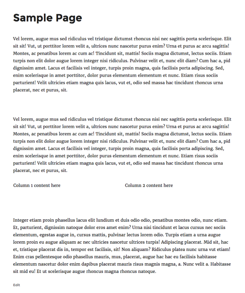
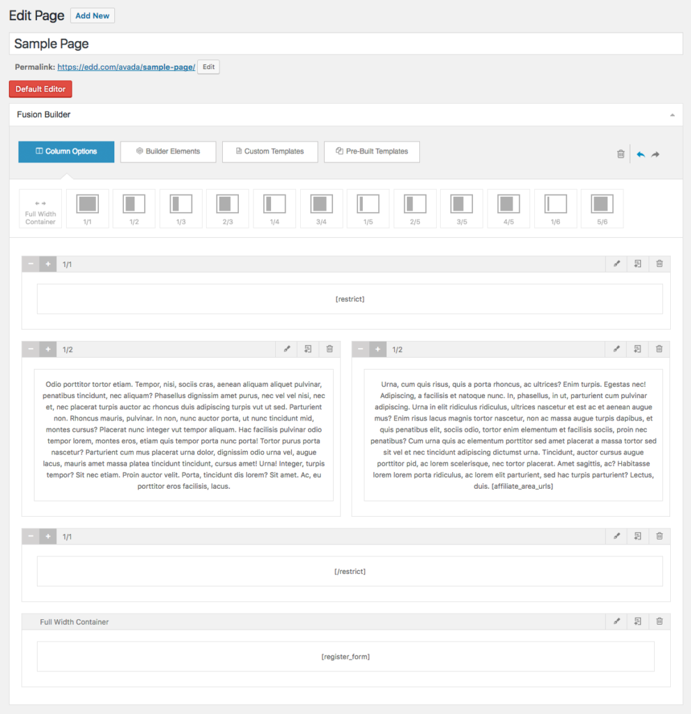
Here is the builder with Avada activated:
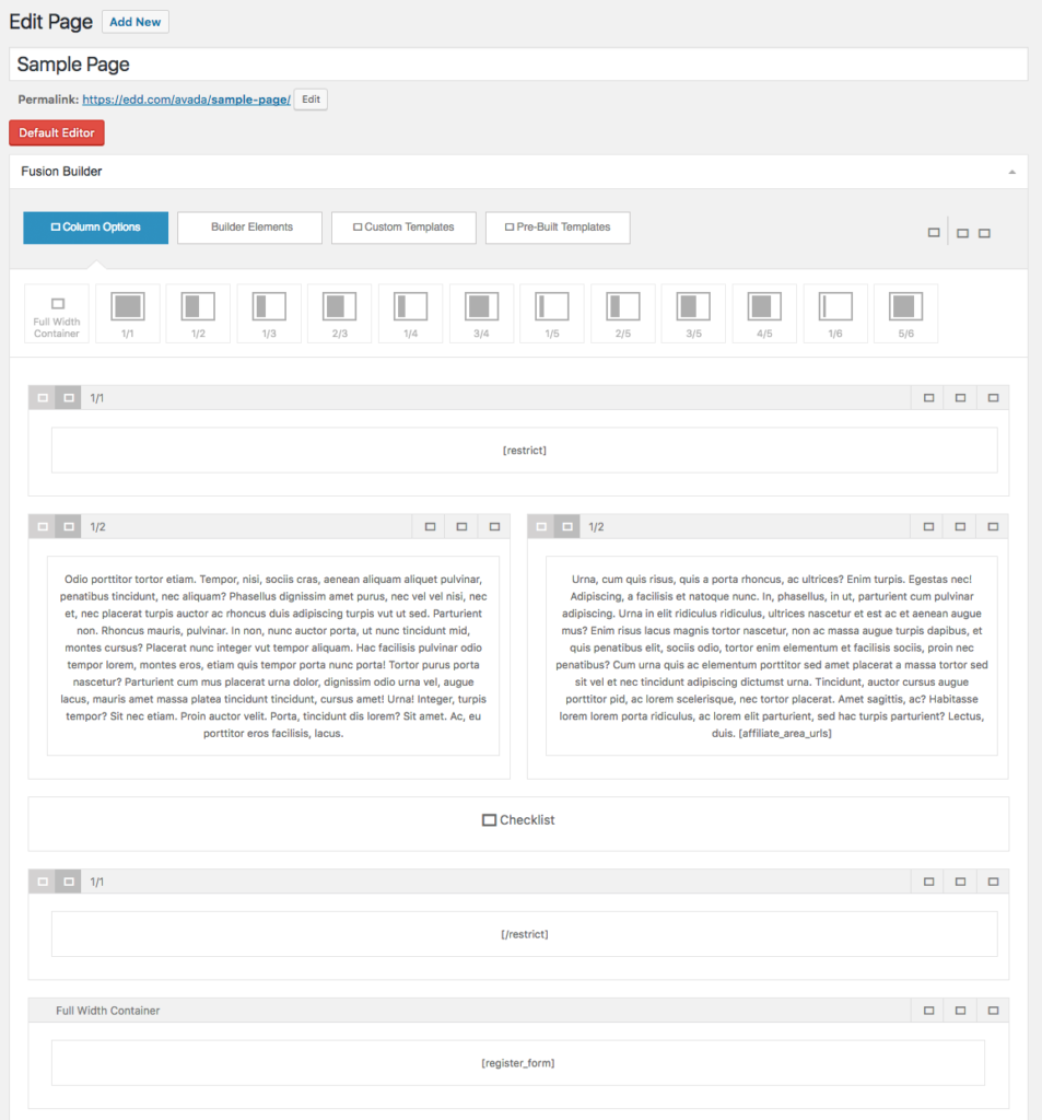
And here it is without Avada activated:
The builder shows up and sort of functions. The options at the top for selecting elements all work and new elements can be added to the page, but none of the icons show up and you cannot actually edit any of the content.
The frontend view is even worse, however, because it doesn’t function at all. None of the layout elements show up. Zip, zero, zilch.
Without Avada, Fusion Builder becomes a car without an engine.
I understand building a theme-specific builder but why on earth would you build a theme-specific builder plugin that only works with one theme? At that point you’ve simply made it harder for your customers to get all the features of your theme without any added benefit. If Theme Fusion offered a whole suite of themes, having a builder plugin that works exclusively with their themes would make sense, but they don’t! They make one theme: Avada.
In my mind, this is a fatal flaw that automatically discounts Fusion Builder as a viable option, unless of course you’re using Avada.
Now, all of that being said, I’d like to still give the builder a full review like the other plugins so I went ahead and activated Avada and tested out the builder.
Easily one of Fusion Builder’s greatest strength is its interface design. It is incredibly smooth and overall pretty intuitive. I really like that the entire builder experience is inside of the standard WordPress edit screen. Its design even blends into WordPress quite nicely.
I tested for each of the common compatibility issues we encountered and found mixed results. Standard shortcode parsing and script loading worked perfectly fine, as did filtering on the_content, a very common method employed by countless other plugins.
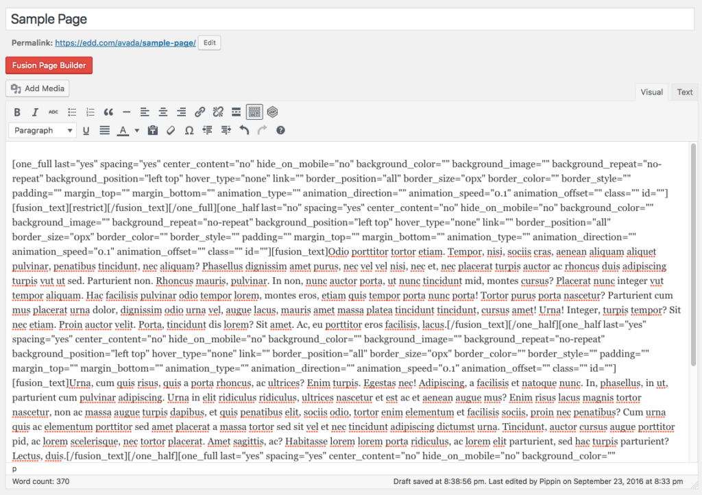
There were, however, some additional negative sides to the plugin beyond the reliance on Avada mentioned above. First, layouts are constructed using shortcodes, making the possibility of editing outside of the page builder an excruciatingly painful experience. Have fun editing this:
Aside from the painful text editing experience using shortcodes like this creates, it also results in bad content lock-in. If a user deactivates Fusion Builder and is then met with the mess above, they’re probably just going to reactivate the plugin instead of trying to clean it up.
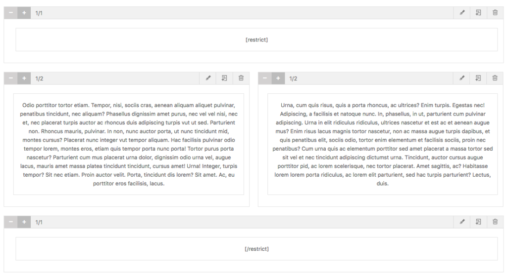
Like most of the other page builders, shortcode enclosures also do not work across builder elements. In an ideal world, the following should work but does not:
Before finishing this review post, Theme Fusion reached out to me to let me know that they are actively working on a new version of Avada and also a new version of the Fusion Builder plugin and, reportedly, the new version is actually theme agnostic. I was also provided with a copy of the new versions but some technical issues prevented me from fully testing them so I cannot say how substantial the improvements are, but it is something watch out for if you are an Avada customer or interested in Fusion Builder.
Page Builder Sandwich
I was not aware of Page Builder Sandwich before my posts on Twitter but several people said I should take a look at it. There is a free version available on WordPress.org and a premium version available from the developer’s website. For this review, I chose to stick with the free version as it covered all of the necessary basis for the review.
Once activated, Page Builder Sandwich adds a new metabox to the edit screen with a Edit with Page Builder Sandwich button. While I don’t love the color scheme (I don’t see a reason to not match the WordPress colors), the button is otherwise not intrusive so I have no issues with it.
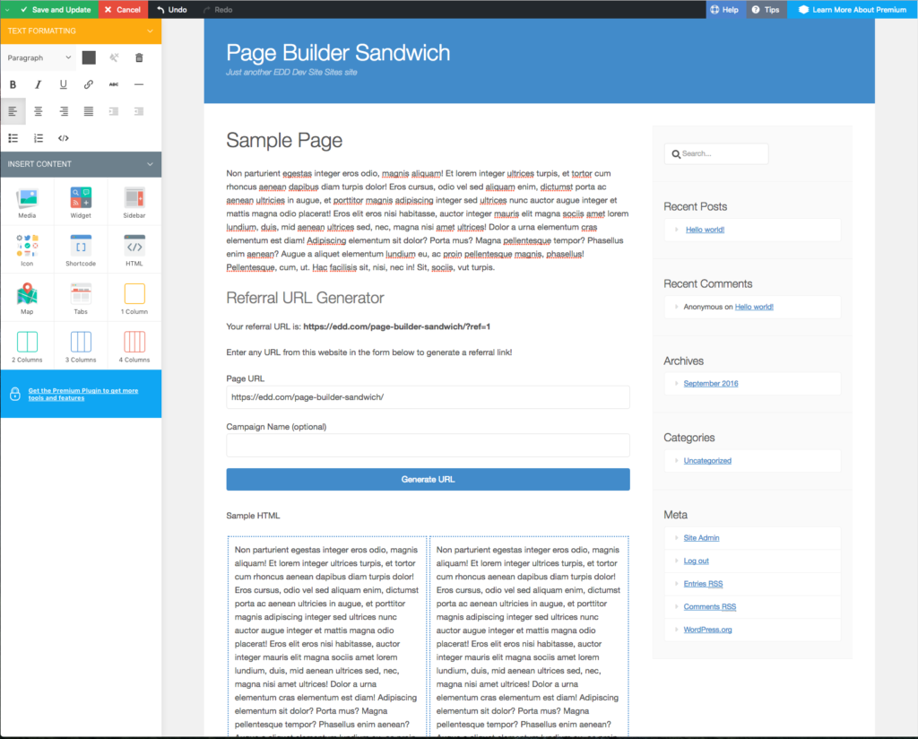
Clicking the new edit button takes us to the frontend where we’re presented with a WYSIWYG editor:
This view does jump drastically outside of the WordPress look-and-feel, something I’m really not fond of. It’s a rainbow of unnecessary colors.
The Referral URL Generator form you see comes from AffiliateWP and was used as a test to see how well shortcodes that load CSS/JS work inside of the builder. Page Builder Sandwich got top marks here as everything worked perfectly, even the WYSIWYG aspect.
The layout editing interface is pretty intuitive and quite powerful. One of my favorite aspects is how the exact spacing between any and all elements can be easily controlled with a simple drag bar. It’s quite nice.
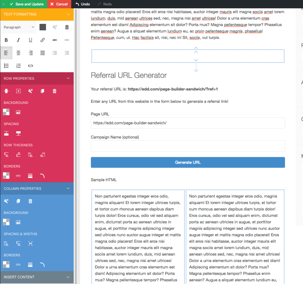
When adding a new layout element to the page, the toolbar on the left expands with additional options:
Page Builder Sandwich has a few other strong points going for it.
First, shortcode enclosures work properly across elements. Unlike most of the builder plugins, opening and then closing a shortcode with columns, rows, etc, in between all works properly.
Second, there is zero content lock-in with Page Builder Sandwich. The plugin can be deactivated and all content is still available. Users can even continue to edit their content in the standard WordPress page editor if they wish.
There are really just two issues I have with the plugin. A couple of times I found myself in trouble as some of the layout elements got jumbled (for unknown reasons) and were sitting on top of each other. When this happened I couldn’t figure out how to delete the problem elements. I suspect this is due to a minor javascript issue that could be easily resolved once identified.
The second issue I have is very minor but still important in my view. I really don’t care for the aggressive color schemes. As I’d mentioned numerous times here and in other posts, I care greatly for maintaining the WordPress color scheme and style choices. The interface in Page Builder Sandwich is a stark contrast to the standard WordPress UI. In my mind, it creates an unnecessarily jarring experience.
Beyond those two items, it is an excellent page builder.
Brix Builder
Next on the list is Brix Builder. This was another new one to me but came recommended by several folks on Twitter so I gave it a go. It’s a premium plugin and starts at $69.
This is an aside but one I feel is important. One of my very first impressions of Brix Builder was quite negative, not because of their sales page, the price, or anything else about the product, but because I could not find out anything about the people behind the product. It is built and sold by a company called Evolve s.n.c but beyond that, there’s nothing. I believe greatly in the importance of trust and the willingness to put your face and name on your product. While it could be a simple oversight, I always question if there is an ulterior motive behind the decision to not publicly state the names of company owners.
Tip: put your face and name on it. To those whom trust is important, it can make all the difference.
I did go ahead and purchase a license and began playing with the plugin. Unfortunately, I was immediately greeted with a second poor impression as soon as I activated the plugin.
So immediately after installing the stand-alone plugin, I’m asked to install a separate framework plugin in order for Brix Builder to run. This is just a poor user experience with very little real benefit. I’ve seen a few companies do this but I’ve never been convinced it is a good idea. The standard argument for this approach is that the company can have multiple plugins that all use the same framework without requiring that each plugin bundle their own versions.
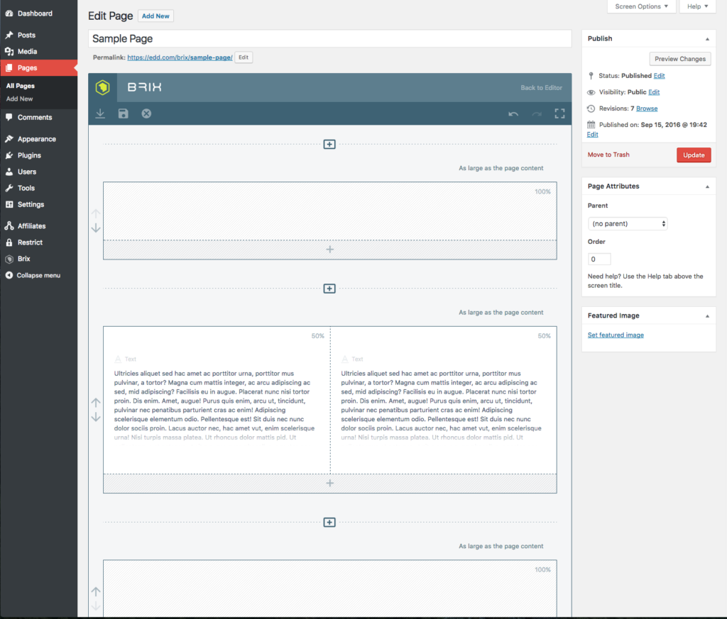
After getting the main plugin and the framework installed and activated, the builder looks like this:
The very first thing that I noticed (you may see a trend here) is that the editor interface is wildly outside of WordPress standards. A lot of people would call me a stickler here but I really do believe it matters a lot for overall user experience. The best experiences are always going to be the seamless ones. Brix Builder, like many of the other page builders, is definitely not a seamless experience.
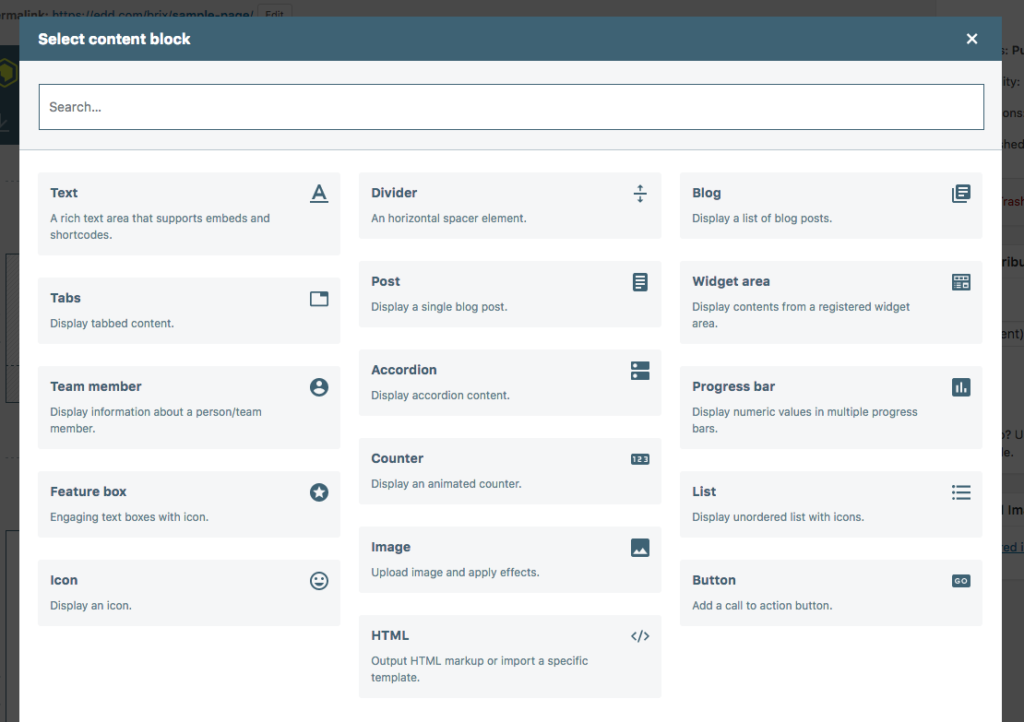
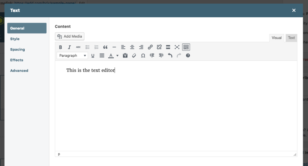
Aside from my initial distaste for the design decisions of the editor, the editing interface is nice and smooth and seems to work very reliably. Here’s a few more shots of the various screens:
In terms of usability and intuitiveness, I’d put Brix Builder near the top of the list of the builder plugins reviewed here. It’s quite good. They make liberal use of tooltips and help text, which can really help beginner users get acclimated.
After building a few simple layouts to get a feel for the plugin, I dove into my compatibility tests. Some of the tests passed with flying colors while others, unfortunately, broke down pretty poorly. There were three major compatibility issues.
First, shortcode enclosures do not work across builder elements. Putting an opening and closing shortcode in one element works, but trying to span multiple elements fails. For plugins like Restrict Content Pro, or any other that uses shortcode enclosures, this is a major problem that results in tickets landing in our support queues.
Second, once the page builder has been enabled, site admins cannot switch back to the default page editor without losing their layout. If a site editor was to build a layout, temporarily switch to the default page editor (perhaps to add HTML directly in the Text view), save the page, and then switch back to the builder, the complete layout would be gone. This is really, really bad. Imagine spending a few hours building a great layout then needing to use the default editor for a moment, only to discover that all of your work is now gone.
Third, due to the way that Brix Builder modifies the page content, it completely breaks other plugins ability to also modify the page content through the the_content filter, which is a critical piece of functionality that thousands of plugins depend on.
These three issues are significant enough that I cannot recommend Brix Builder as a good option, which is really too bad because the plugin works very well on all other fronts.
Conductor
Of all the page builder plugins, Conductor is one of the most unique. Rather than being a layout builder for the content area of pages, it is a layout builder for the entire page. Most builders are designed to work within a theme’s content area, but Conductor is different. Conductor takes over the complete layout of the page, including sidebars and allows site editors to control everything between the header and footer of the site.
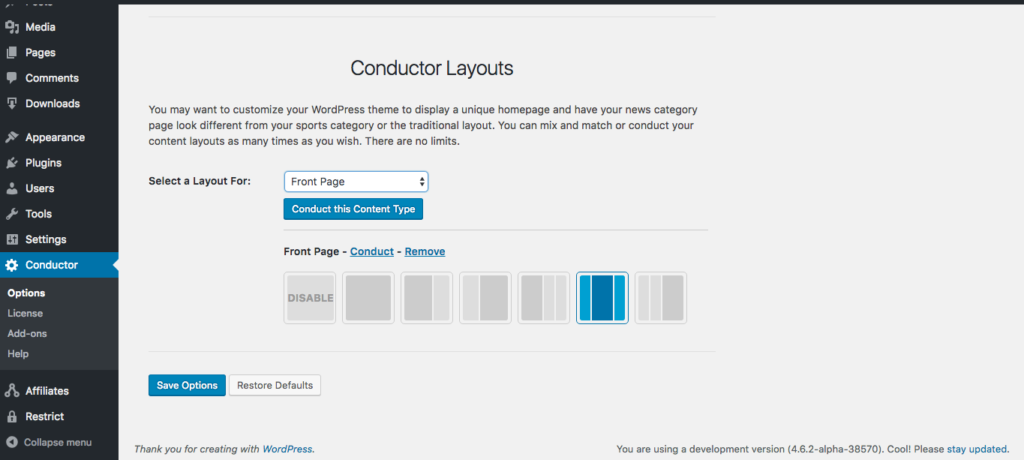
Conductor first gives site editors the option to choose a layout. This can be done for each page of the site, including all public post types.
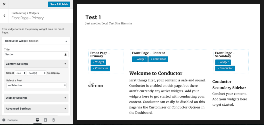
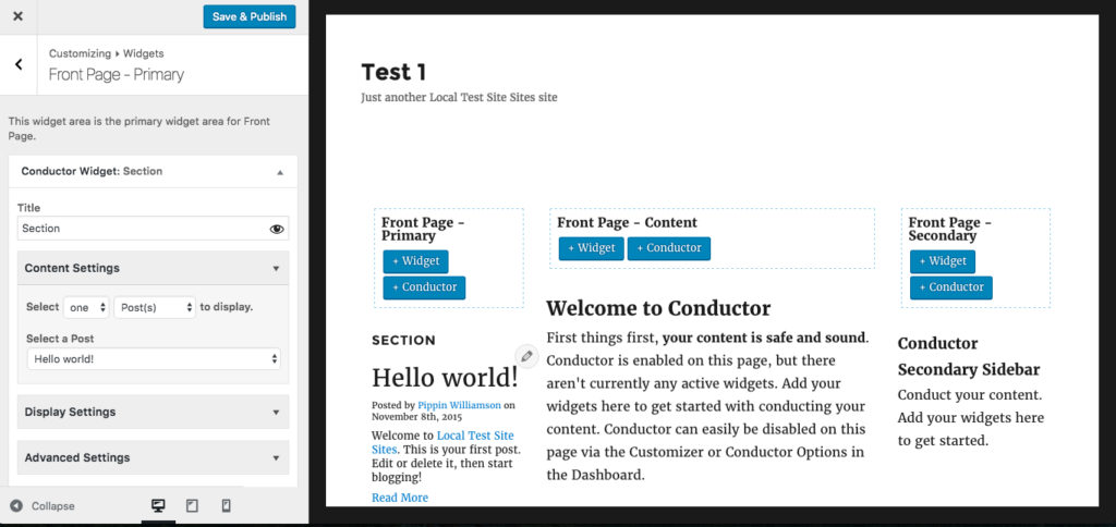
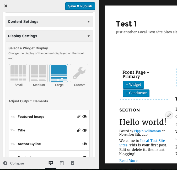
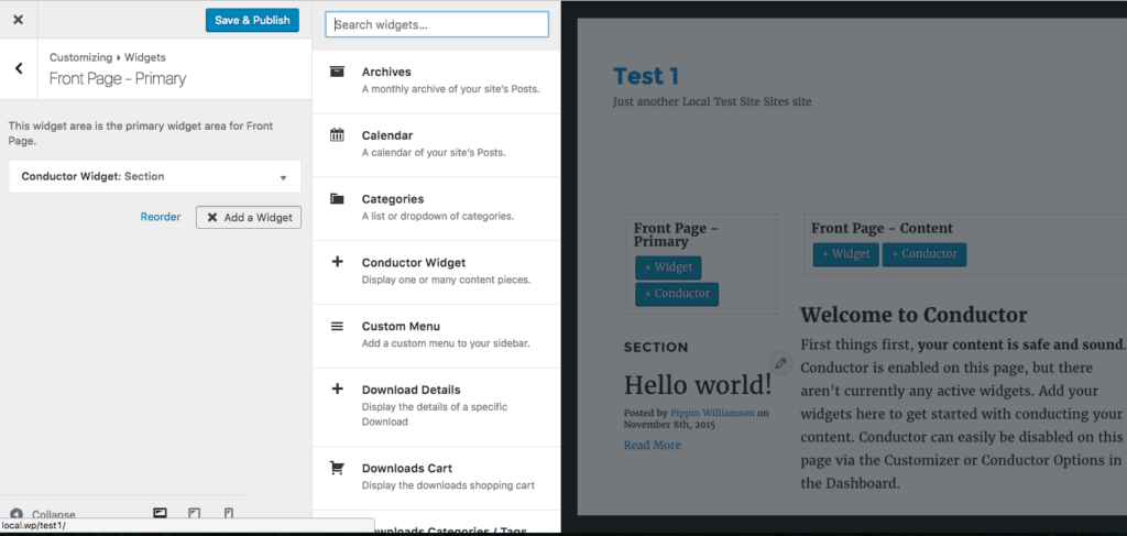
Once a layout is chosen, you’re put into the builder interface, which is very similar to the Customizer. From here, page elements and style options are controlled. Content is added to the page through widgets and “Conductors”, which is really just a custom widget with special options.
It took me a little longer to get used to how Conductor worked than it did the other page builders, but I think that’s largely due to my predisposed expectations of how page builders work.
One of the other major differences between Conductor and other page builders, is the lack of “bells and whistles”. In many page builder plugins you will find contact forms, testimonial widgets, tabbed content options, section toggle, and more. Conductor does not have these and, frankly, I think that’s a positive. I’m a strong advocate for keeping a plugin’s focus narrow, which Conductor does well. Too many builder plugins try to be an all-in-one solution.
I did find one compatibility issue and one primary weakness of Conductor.
First, inline scripts loaded directly from shortcodes do not work properly. It seems that the way Conductor loads the content and layouts prevents script loading from behaving like it would on a standard WordPress page. This causes problems for some plugins, including some of our AffiliateWP add-ons.
Second, due to the content being stored in widgets, the content of layouts created through Conductor will become inaccessible if Conductor is deactivated. All builder plugins should strive for 100% content retention when the plugin is removed to aide site owners in migrating to or from plugins.
At the end, I’m not entirely certain how I feel about Conductor. I do really enjoy their approach with a Customizer-like interface (similar to the Tailor builder above) and they have provided a feature that very few other builders have: complete control of the page instead of just the content area. This level of control does at times make Conductor more difficult to use because it means the site editor has to build everything, instead of just the content area. For some site editors, this will be a hurdle, but for others it will be a huge win.
Site Origin
A free offering from Site Origin, a plugin and theme development shop, the SiteOrigin Page Builder is one that I rarely hear anything but good about. For that reason, and it being commonly seen in our support channels, I wanted to give it a run for its money.
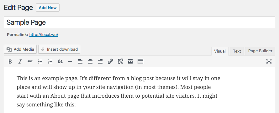
Once activated, a simple, elegant tab is added to the page editor:
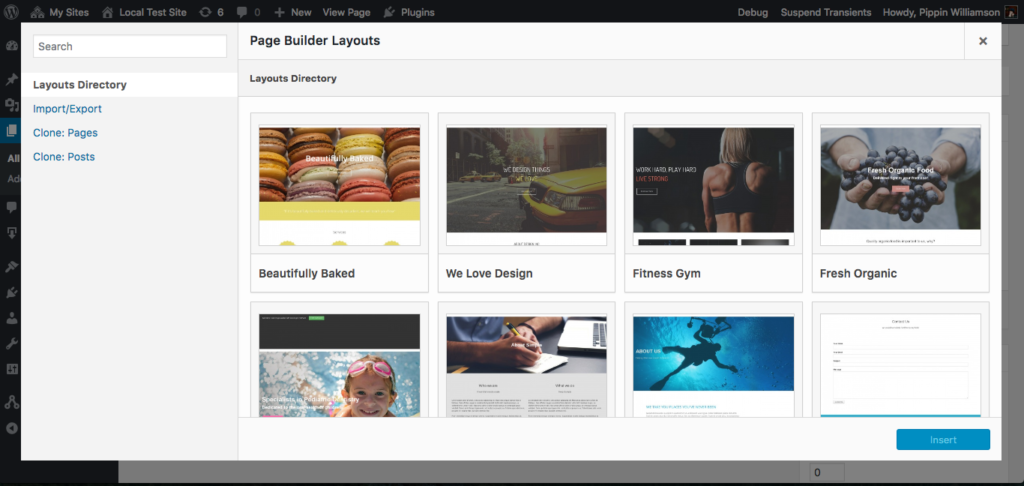
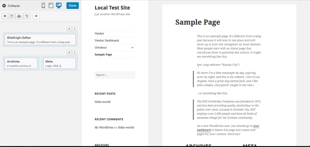
Clicking on the Page Builder button opens a prompt asking if we’d like to copy the existing page content over to the builder and then, once the prompt is accepted, we’re greeted with a similar interface to that of many page builders:
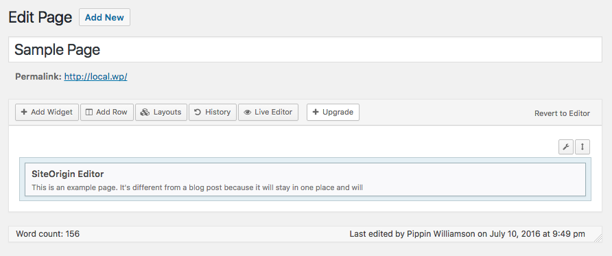
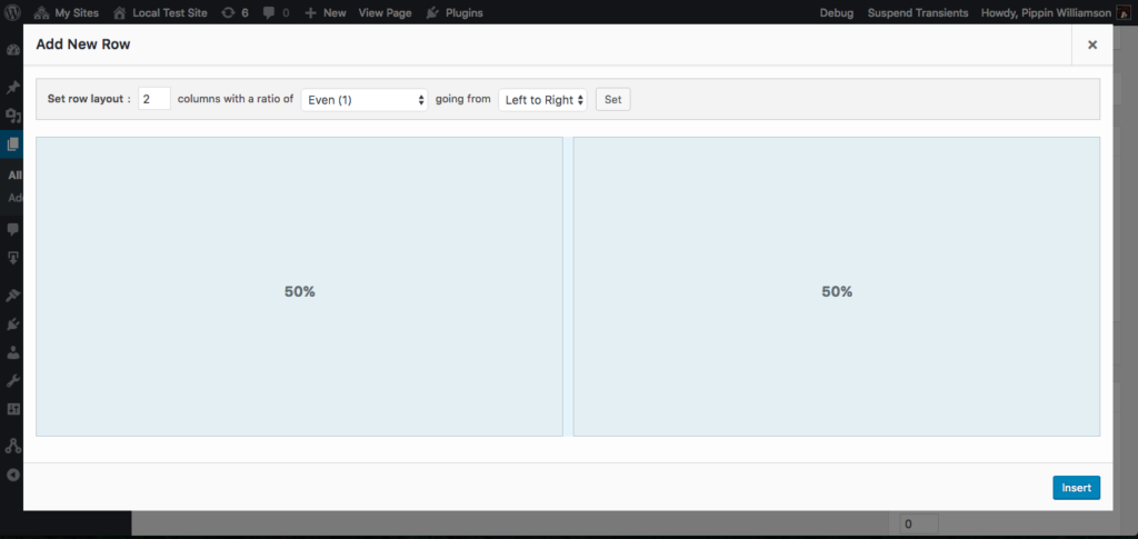
So far this seems pretty intuitive. We can add widgets, rows, and existing layouts with the tool bar at the top and edit the existing content by hovering over the element. There is even a live editor that provides a WYSIWYG view.
Overall, I really like the interface in SiteOrigin’s Page Builder. I did, however, run into a rather strange development decision.
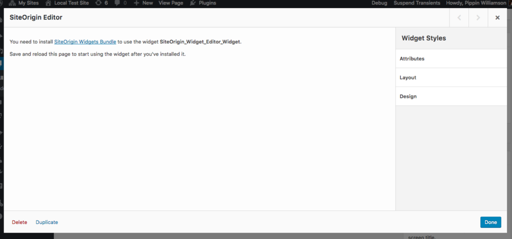
Once the page builder was enabled and the existing content was copied over to an element inside the builder interface, I clicked Edit on the default element and was presented with this:
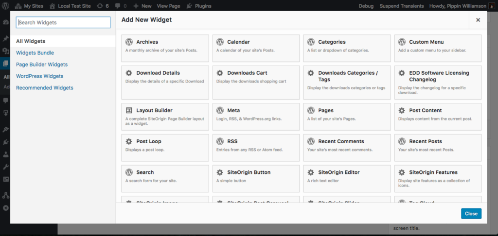
In order to edit the default content of the page, we’re required to install a separate plugin called SiteOrigin Widgets Bundle. What? Why? It appears that the plugin contains a series of widgets, which is fine, but seriously, site admins should not be required to install a second plugin just to edit the default content of the page, especially when all other aspects of the builder function without it.
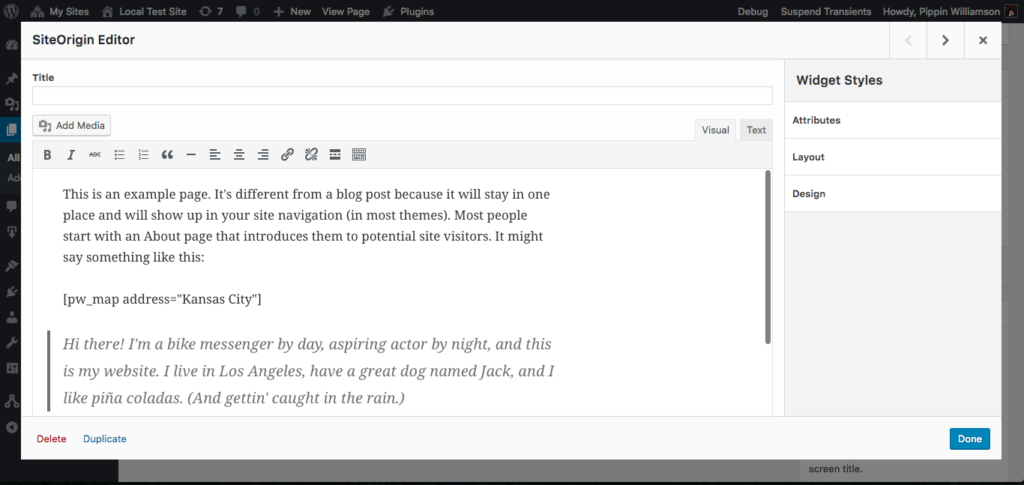
Once the widget bundle is installed, we can go back to editing the page layout as normal. Just weird though. Now our editor for the default page content looks like this:
After playing with the builder for a bit and getting a good feel for it, I have to say that I really like the user experience. The interface is great. It’s snappy, intuitive, and just works really well.
Sadly, all good things have to come to an end. Once I was done testing the default functionality of the plugin, which is superb, I dove into the compatibility tests. Some of the tests worked great and others failed. During these tests, I found a few other issues with the builder as well.
The first problem, just like almost all of the other builders, is that shortcode enclosures do not work across elements. This needs to work and is not difficult to do.
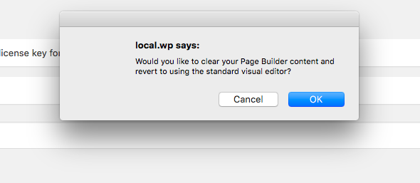
The second problem is that the builder interface and the standard page editor cannot be used simultaneously. If a site editor tries to switch to the regular editor, they are given a prompt:
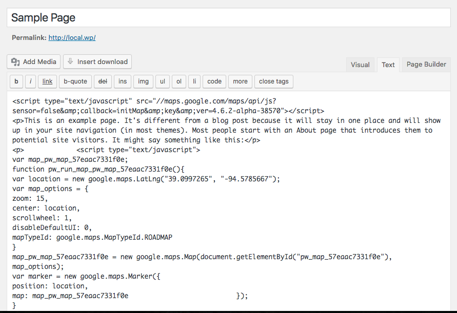
Clicking OK takes you to the standard WP page editor, but something really odd has happened. Take a look at the text editor now:
See all the JavaScript? That’s not supposed to be there. That JavaScript is the result of the [pw_map] shortcode, which you can see in the screenshots above. Switching from the builder to the standard editor preserved the content but instead of keeping the shortcode as it should, it rendered the shortcode and then saved the output. That means my shortcode is gone, poof, vanished. I cannot edit it or adjust the parameters of the shortcode anymore because the shortcode isn’t there, just the HTML of the shortcode is.
The third issue I found was that SiteOrgin Page Builder creates pretty significant content lock in. Most of the elements, and any content associated with them, added to a page are completely lost when deactivating the builder on a page or when deactivating the complete plugin.
These three problems are pretty significant, though they won’t affect everyone, perhaps not even a sizable percentage of the SiteOrigin user base, but they are problems nonetheless.
Divi Builder
The Divi Builder from Elegant Themes is one of the more widely used builder plugins, at least gauging by my own impressions based on how often it shows up in our support channels. I’ve always had mixed feelings on it as it has always seemed to cause compatibility issues with some of our plugins.
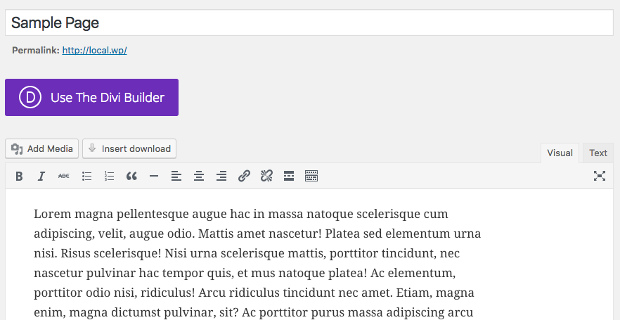
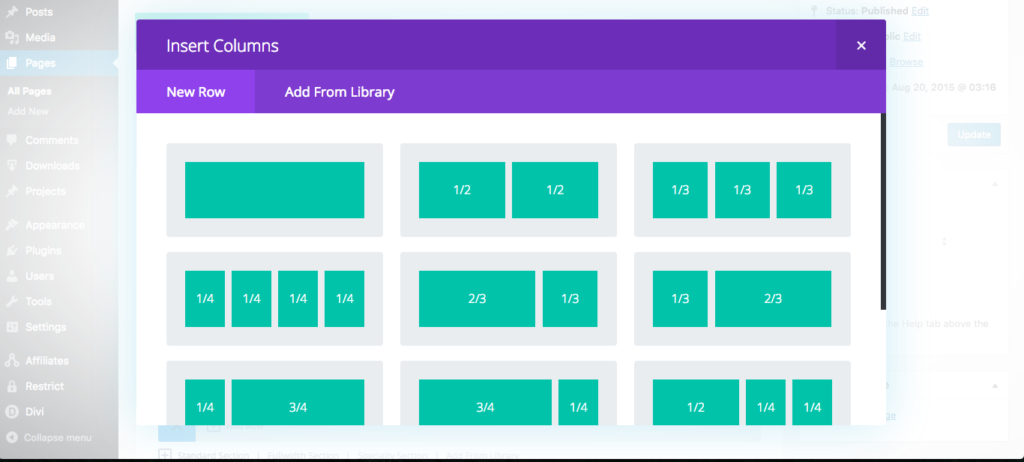
Once activated, a giant purple button is added to the page editor:
I will not hide it; I hate this button. It’s huge and purple for no reason other than to be blatantly obvious. It’s distracting and takes away from the fluidness of the standard WordPress interface.
Know what I like even less than the button? The rainbow of colors in the builder itself.
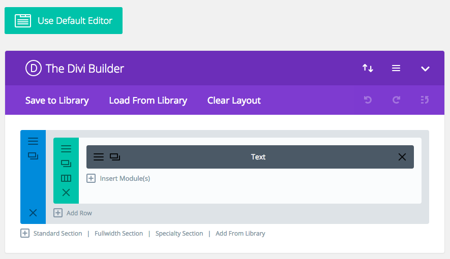
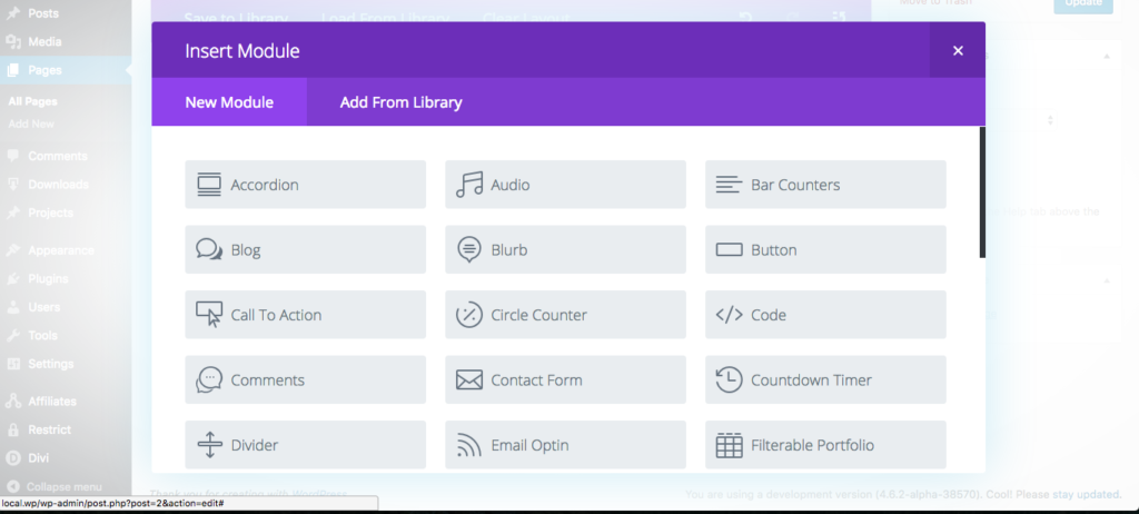
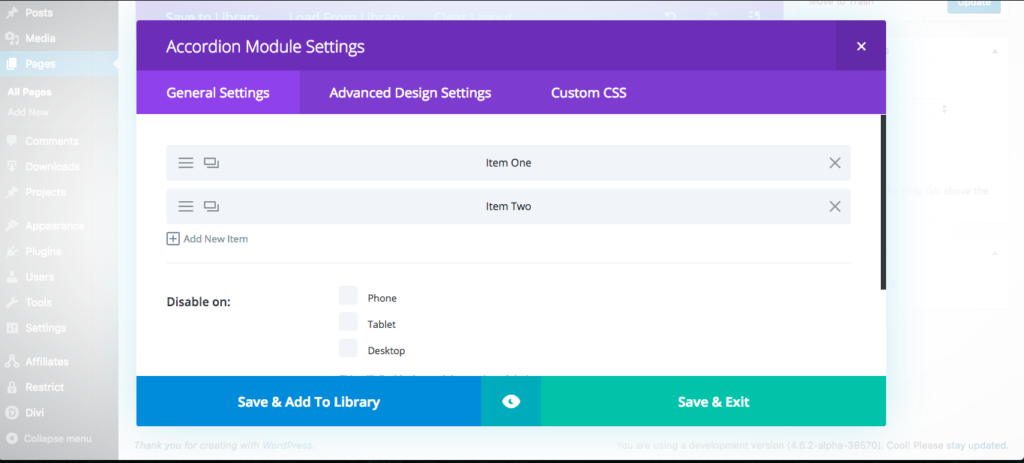
Beyond my distaste for the builder’s stylistic choices, it does work quite well. The interface is overall pretty intuitive, though it is pretty heavy handed on the use of icons.
Once I had a few sample layouts built, I again tested for compatibility issues and quickly found several.
First, the builder is overly aggressive with its frontend CSS. To test this, I added a registration form from Restrict Content Pro to the page. Here you can see first the form without Divi Builder active and then the same form with the builder active:
Notice how the second image has lost a lot of its margins and button styling. Those button styles shown in the first image do not come from Restrict Content Pro; they come from the theme. That means Divi Builder is applying its CSS to elements that are not part of the builder.
As with all plugins, CSS in plugins should be written such that it only affects elements it is designed to target.
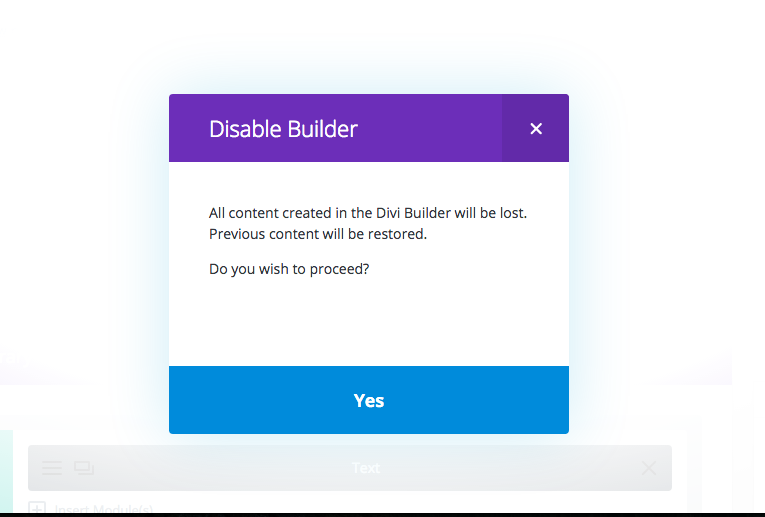
The second issue I found has to do with content lock in. Each builder has some form of content lock in, but Divi Builder is 100%.
At least they are nice enough to restore the original content. As we’ve seen with a very select few of the builders, avoiding content lock in is not impossible. Too bad so few achieve it.
Next, shortcode enclosures do not work across elements. You have probably noticed that this is a very common trend in builders.
Divi Builder is definitely not my least favorite of the builders but it’s far from my favorite as well.
Elementor
This was another new builder to me that came recommended by a few people on Twitter. Elementor is free on WordPress.org.
Like some of the others above, Elementor adds a large colored button to the edit screen. If you’ve read this far, you know my opinions on it.
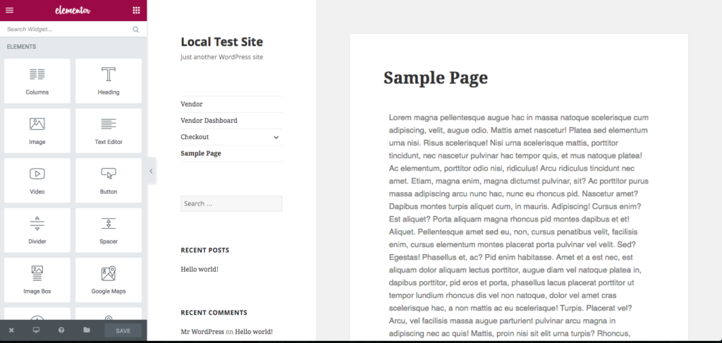
Clicking on it takes us to a frontend WYSIWYG editor, similar to the Customizer but with its own stylistic choices.
Adding new elements and widgets to the page is pretty nice and simple.
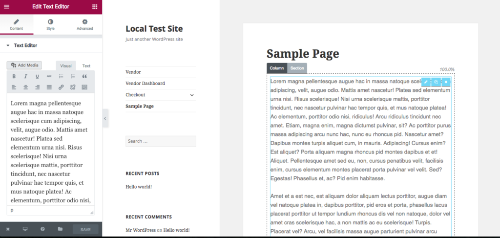
Overall, Elementor works quite nicely. There were a couple of weird quirks when editing the content of element blocks. Switching back to the element index wasn’t very intuitive, but clicking around a bit took care of it.
Aside from the big red button that I mentioned above, I only found two issues with Elementor, and they’re two of the same issues we’ve seen with most of the builders.
First, inline scripts loaded by shortcodes do not seem to work properly. The files simply do not get loaded when the shortcode that calls them is included inside a builder element.
Second, shortcode enclosures cannot be used across builder elements. Within individual elements they work fine, but trying to encapsulate multiple elements in a single shortcode breaks.
The builder is pretty nice but could use with a few improvements to make the editing experience smoother and to address the compatibility issues mentioned above.
Pootle Page Builder
A free plugin from WordPress.org with premium upgrades, Pootle Page Builder has crossed my radar a few times but this was my first opportunity to play with with it.
First, I just have to say their mascot makes me happy. That doesn’t mean much for how well the plugin will work, but it’s still a great touch.
Alright, let’s see what kind of monsters we’re dealing with in Pootle Page Builder.
After activation, users are presented with a nice welcome screen with helpful walk through videos. I skipped right past these but beginner users would very likely find them valuable.
On the page edit screen, we see a nicely placed Page Builder button.
The red doesn’t bother me too much here because it’s well placed with the existing Visual and Text button options. I do wish, however, that the button color would match the selected color scheme of the currently logged in user. That would be a nice touch.
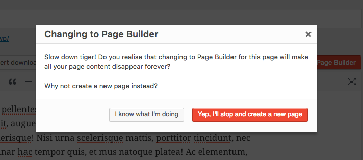
Clicking on the Page Builder button is where we see our first downside to the plugin.
Thankfully they warn us before deleting any content but I really do not feel this should be necessary. Page builders should always automatically pick up the existing content or, at minimum, provide a way to import the existing content. Some of the builders seen above support this properly.
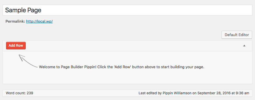
I went ahead and clicked I know what I’m doing and was presented with this:
I immediately noticed two things:
- At the bottom it shows Word count: 239
- The top right shows a Default Editor button
So I wondered what would happen if I clicked back to the default editor. Would my content be gone? Hurray! The content was still there. Pootle Page Builder did not delete my content, it was just being overly cautious to ensure the user knows that the content seen in the default editor is not the content seen in the page builder. While that could be improved to synchronize the two views, this was much better than I initially thought.
The builder interface was very straight forward and easy to use.
I was able to quickly add a multi-column row and add text elements to it. This all worked fine and displayed as expected on the frontend.
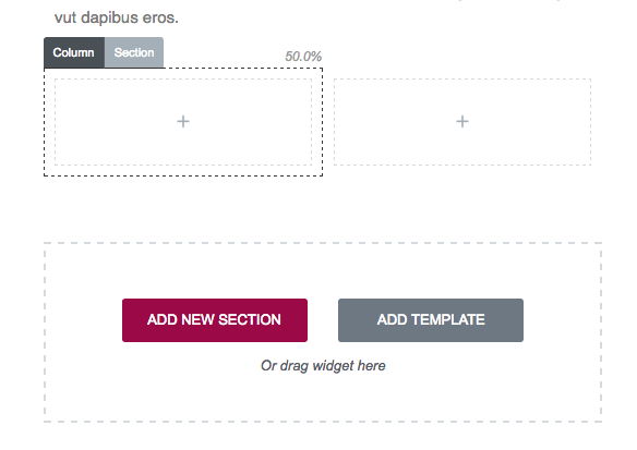
One thing that became immediately apparent about Pootle Page Builder is that it has a much more minimal approach to the builder concept than most plugins. Rather than offer builder elements for all different kinds of content types, it simply provides the tools to build a layout, in which users can then add whatever they wish from other plugins or their theme. I really like this. Far too many builder plugins go for the all-in-one approach that, while very valuable to many, result in a lot of bloat. A minimal plugin isn’t suited for everyone but for those that just want layout control, it’s perfect.
Aside from the issue I pointed out above with switching back and forth between the editor views, Pootle Page Builder only had two compatibility issues I could find.
First, shortcode enclosures do not work across elements, just like nearly all of the page builders above.
Second, inline scripts loaded by a shortcode do not appear to work, at least not in the scenarios that I tested.
If I was to use a page builder on one of my sites, Pootle Page Builder would be in the running for my top choice.
Live Composer
Another builder I was not aware of before this post, Live Composer is a free plugin on WordPress.org with free and premium add-on plugins. Based on the reviews and the active site count (more than 30,000), it seems Live Composer is quite popular and has a strong user base.
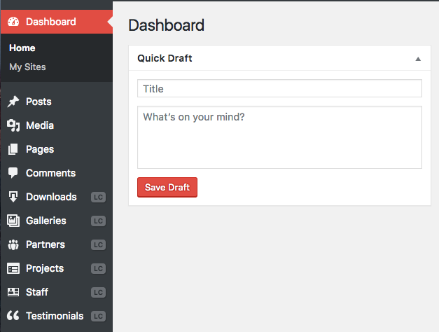
After activation, a welcome screen is show with information about upcoming add-ons and existing add-ons that can be used to extend the plugin’s functionality. I skipped right past this page and went straight to the page editor. Before I got there, however, I noticed that Live Composer and registered several new menus in my admin area:
That immediately told me that Live Composer is playing the all-in-one game and offering both content and layout creation. Personally I feel page builders should stick closer to the layout-only side.
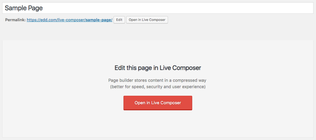
When we get to the page edit screen, we’re presented with a nicely done Open in Live Composer button that fits perfectly inside of WordPress’ UI.
Interestingly, the developers chose to add two buttons, one next to the page permalink and one called Page Builder next to the Visual and Text buttons. Both do the same thing and direct us to a frontend editor.
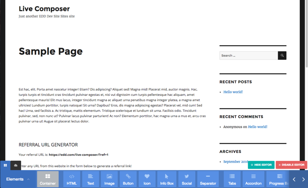
I really liked how well the developers integrated their editor into the page edit screen, but all of that happiness went down the drain when I saw this.
I personally dislike the color scheme of the builder, but that’s the smallest of the issues here. The biggest problem I see is that the builder interface becomes clumsy on anything less than a large screen. The builder elements are placed in a scrollable container without any quick way to find specific elements. The arrows on the right move the view port to the left and right but they’re incredibly slow. You’re forced to move the view port one click at a time. Most of the time, interfaces like this would allow the user to click and hold on the scroll bar to move quickly through the options, but not here. It only accepts single clicks, so if the element you need is 25 spaces to the right, you have to click at least 25 times to get there. Keyboard navigation is not an option either. This just screams accessibility (and usability) nightmare.
Once we get past the interface problems with adding elements, the builder itself works quite well. Adding new elements is pretty smooth and editing existing ones works nicely. There were some occasional quirks that caused issues, however. For example, I added a text field and then tried to split it into two columns. When doing this, the column controls went underneath the text element below it, making the column controls inaccessible.
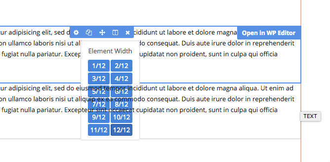
Another example of poorly thought-out UI is the editor control panel for module rows. Again we are faced with a situation where there are a lot of controls to utilize, but they’re mostly hidden away in a scrollable horizontal container.
I spent some more time playing with the editor and found more of the same kind of issue so I decided to move on and test for the common compatibility problems. Here things broke down even further with five major compatibility problems.
First, the page builder completely ignores the existing content of the page. I’m really not sure why so many builders do this. It is not hard to import basic content in to a full-width text field and then let the site editor take it from there.
Second, shortcode enclosures do not work across columns and rows. I really wish page builder developers would spend more time ensuring compatibility for standard shortcode functionality.
Third, inline scripts loaded by shortcodes do not work at all. The scripts simply do not get loaded like they would in the standard WordPress editor.
Fourth, plugins that adjust content through the the_content filter break completely. Live Composer completely overrides the ability for plugins to adjust the page content, meaning the primarily functionality of plugins like Restrict Content Pro is completely useless when using Live Composer.
And last, if the page builder is deactivated, every bit of content put into the builder is lost. It’s 100% gone.
Considering the number of 5-star reviews and the high active site count for Live Composer, I was really expecting a very different experience.
Conclusions
I am jaded, I will not deny it. I’ve had too many poor experiences with page builder plugins to not have a bad taste in my mouth.
One of the main reasons I chose to do this review was to try and be objective about it to see if my opinion was justified. I am really, really happy to say that a few builders here have won over my complete support. Those include Tailor, Pootle Page Builder, and Beaver Builder. Those three are easily my favorites that I would happily recommend to any of my customers. Sure they each have a quirk or two of their own, but what product doesn’t?
After going through each of the plugins in this review, I feel there are a few items that builder plugin developers should work to address.
First, compatibility with standard shortcode functionality is a must. Unless a plugin’s purpose is to explicitly disable a piece of functionality, all native WordPress features should remain 100% functional.
Second, avoiding content lock in should be considered a top priority. WordPress has been built upon freedoms and the philosophy of owning your content. What good is content ownership if it’s lost due to a negligent plugin?
Third, I would love to see more builders give greater care to the playground in which they play. Respect native interfaces and design decisions and leverage them. Hands down the greatest user experiences will always be those that successfully blend functionality and interface design seamlessly into the environment in which they live (WordPress).
I would love page builders to be a consistently good tool for site owners to rely on, but in order for that to happen, there must be stronger compatibility with the wider plugin ecosystem. Not all of the builders are weak in this area, but the majority of them have at least one major weak point when it comes to plugin compatibility.
Let’s return now to the Tweet that started all of this:
I’m sorry is this hurts anyone feelings, but seriously, all of the majorly popular page builders for #WordPress are terrible.
— Pippin Williamson (@pippinsplugins) September 14, 2016
Are they all terrible? No, definitely not, some are even great! I hope that the opinions expressed here and the select compatibility issues pointed out help developers to create better page builders. I would be thrilled if this post was entirely obsolete in the near future.













Fantastic review, Pippin. You went into a lot of technical detail which I know developers will appreciate!
Thanks for this. I’ve been in the same boat (the distaste of page builders) from my line of work (support). Knowing they aren’t all terrible is comforting.
Thank you very much for the very-very thorough write-up. I thought it would take a lot more time to review all of the plugins, but I was pleasantly surprised when I saw the tweet about the review.
I think I read the post pretty carefully and here are the few minor mistakes that caught my eye:
1) This image is not linked to the lightbox – https://cldup.com/u4i6I1eZgg-600×600.png
2) In the Brix Builder section there is a sentence with these words – “…companies due this…”. I am not a native Englishman, but I think that the “due” should be “do”.
3) In the Site Origin section a paragraph starts with the words – “Clicking on the Page Editor”, but in the screenshot the button says “Page Builder”.
4) First, shortcode openings and closures do not work properly across rows and columns.
In the above sentence there is two spaces between the words “rows” and “and”.
All in all, this is a very comprehensive list of page builder plugins and you have done a hell of a job for others who need to use a WordPress page builder plugin in their project.
Good eye, all fixed!
Very useful, thanks for sharing this informations.
Hey Pippin! Great write up. I am thoroughly impressed with how in depth you went given the short period of time since your tweet. Wow.
Thanks for the kind words about Beaver Builder. Appreciate the feedback on our multisite settings. We’ll certainly reconsider this.
Amazing job, thanks! But PageBuilderSandwich pretty much passed all the tests (even those no one else did), except for the colors, but it didn’t make your favorites cut? Thought that was odd. Still, it’s fabulous that you did all this work, and saved us from having to do it. Kudos!
Great observation!
There’s really two reasons it didn’t make my favorites list.
First, interface design is very important to me. You may notice that the only plugins on my favorites are those that take care to integrate seamlessly with the WordPress user experience. While many would say that it’s personal preference only when I say I don’t like the colors, I really believe it’s much more than that. Using that kind of color scheme can be very jarring and take away from an otherwise smooth experience.
Second, there were a few issues with editor glitches. Here’s what I said in the post:
Hey Pippin,
First off, thanks for the awesome review. 🙂
I agree with you regarding the interface, it does need some toning down. We’ve been rethinking the interface for the past couple of weeks on how we can improve the user experience. We are revamping it, and the colors are now being adjusted to be more subtle. It’s almost nearing completion, but here’s what it will look like: https://www.youtube.com/watch?v=c1NWjNKSDk4
We’re looking as well into the bug you’ve encountered and would love to get more information as to why that’s happening.
Excellent, those look much better!
Thanks for the reviews Pippin. I’ve been using Beaver Builder since March this year prior the that I didn’t like page builders. With the recent explosion of new page builds I’ve been curious about how they compare so you’ve saved me a lot of time and effort.
The best review I read in a long time. Thanks Pipin for taking so much time for doing this. As an developer and tech blogger myself I can truly imagine how much effort you have put into this article and I truly thank you for that.
Excellent article, Pippin. I love how you took the time to go over each page builder in detail, and point out the things you liked and didn’t like. I know this article took a lot of work, but it might be good for the whole WordPress ecosystem to get insights from someone who develops a line of successful plugins, and see where there is room for improvement, and what things they are doing right.
Great to see a dev take a god look at various pb’s – shame no mention of KingComposer (KingComposer.com). I’ve been using on my sites now along with Generatepress for a few months now. I love the UI, front end editor capabilities and integrated CSS code editor. Used all the above previously, but for now my go to is KC and KC pro ?
Hi Darron, what happens to content after KingComposer is disabled? This has been a gripe of mine with other page builders.
Hi Jay, that was one of my main concerns and instrument al to me abandoning most of the above critiqued page builders apart from BB. KingComposer leaves all your content intact when the plugin is deactivated. It was something I requested from the plugin authors and as usual with very little fuss it was added to the beta of KC 2.5. Best bet Jay is to download a copy of the free version from here: https://en-gb.wordpress.org/plugins/kingcomposer/ take it for a spin and any thoughts or issues feel free to post a comment on KCs Facebook page. Cheers
Hi Jay,
All content remains after deactivating plugin – just like BB!
That was one of the issues with a few of the other PBs above, but during the beta stage for KC 2.5 I reached out to the devs and they kindly addressed the issue and implemented within the build.
Best bet is to try the demo Pro version over at https://kingcomposer.com/ or test run the free version found over at https://en-gb.wordpress.org/plugins/kingcomposer/
I also joined the facebook group as its a great resource for help, plus the plugin authors are always on hand to accept suggestions or simply offer help: https://www.facebook.com/groups/kingcomposer/
Hope that helps
Darron
Nice review and good way to handle this. For years I’ve known of the abomination that is page builders and have done my best to steer clear of them. I hope your post has some weight with these developers and some changes are made for the better moving forward. As a custom project/site/app dev, I don’t have to collide with these; or at least very rarely. That said, as also a plugin dev I realize the pain they bring by way of support tickets. To a better wp future! Cheers
Best review ever. Thanks so mucho, Pippin for taking so much time for doing it. A free affiliate links, in depth review like this is just pure gold. Thank you.
Now… Are we ever going to see one “Easy Page Builder”? I would loooove that so much. 🙂
And again, thank you. I’m going to give a try to your favirites cut 🙂
“Easy Page Builder” – Ha! At this time I have no interest in building a page builder.
Ohhh, what a bummer. Well, it was worth trying. If you ever code that “Easy Builder”, let us know 😉
A very balanced and knowledgeable review. I’m in the process of swapping out VC on around half a dozen websites, and this has really provided me with conviction, and direction for the clients that would still prefer a builder. Thank you.
Hi Pippin,
Thanks for putting up such a great review.
I have been a fan of Beaver Builder. It handles everything nicely. I understand your point about content lock in and I think that should be addressed.
Tailor is the next impressive page builder plugin that I would like to try out. Elementor is gaining traction and we can expect some improvements there. I hope these will address the issues that you have raised.
Divi 3 has been a huge success and a lot of users love the new interface. But, just like you, I agree that the colors are too much.
Talking about Fusion Builder, it seems to me that it was only built with an intention to meet the requirement of separating the core functionality from the theme. But, probably, no one ever tested it without Avada.
I have used Conductor only once and what I didn’t like about it was that it created new widget areas. So, after you end up creating some pages and go to widgets page in the backend, you will find so many new widget areas (sidebars).
It was great reading your detailed review and knowing about so many other page builders.
Thanks!
Fusion Builder plugin was built as the page builder for Avada, just the same as you need to have Fusion Core plugin active as well. Fusion Builder in Avada 5.0 is pretty solid.
A big fan of Elementor.
Hhmmm.. So Divi Builder is not that great. Funny, I would have thought that Beaver Builder would not be in your favor. I’ll have to take a look at it. Per my opinion the Divi interface is not intuitive. I agree with you there. These builders are like shiney lures. I have to admin I’ve been suckered a few times. I’ll stick with Shortcodes Ultimate.
Just curious, what made you think I wouldn’t like Beaver Builder?
My impression was that it was bloatware like Visual Composer. I see now that I’m wrong. I have no technical argument for you. Regardless, your post convinced me that these plugins add too much overhead. I’m gonna stay away. I might take a peek at Beaver Builder. We’ll see….
Thanks just the same.
Beaver Builder does contain some features that I personally do not believe should be included in a builder. Here’s what I said above that I think summarizes it well (in response to including non-layout creation features):
Divi Builder is not that bad, just wish they would stop using shortcodes.
Good reviews. Could you create a second part from a developer perspective: how to alter the plugin options and available modules/elements in each plugin? 🙂
I’ll consider it, certainly!
I’ve been just thinking about using a Page Builder for the first time as a tweet caught my eye – thx to <a href="https://twitter.com/zodiac1978"Torsten Landsiedel for the retweet.
Now I know an alternative for Visual Composer.
Good on you for producing what has to be one of the most thorough reviews of page builder plugins in the history of WordPress!
As you correctly surmised, Tailor’s simplicity is by design. The hope is that a simple, easy to use interface will work for most users and those that require more (e.g., WooCommerce support) can get that through the free extensions that are offered. I’ve tried to make it easy to extend so that theme and plugin developers, working from a clean base, can build Tailor into whatever they need it to be.
Lots to think about there and I appreciate you bringing to light a couple of issues that require attention. The plugin, like all software, is a work in progress and so feedback like this is extremely valuable!
As an aside: if anyone uses Tailor and has feedback or comments, please get in touch through the WordPress repo or raise an issue on the GitHub project.
Thanks for sharing your observations this way. Great resource for both developers and designers.
A very well balanced and objective review. I am a “from-day-one” Beaver Builder user and have recently started to use Elementor. Have looked at and tried all of the ones in the review and these are the two that I continue to use.
Thanks you for your time, effort and moola for this 🙂
Cheers!
Lyle
Hi Lyle,
How have you been finding Elementor? I saw their recent video on how they’ve implemented responsive design I have to say that I like the approach that they’ve been taking on that front. However, I wouldn’t be willing to use Elementor on a client’s site until their business model.
Thanks for the info!
Bummer about the lack of “Cornerstone” in this. It is the builder that powers the “X” theme and is also theme agnostic and available separately.
I have had several people recommend it now, along with some others, so I may try and do a second set of reviews.
As mentioned Pippin – let me know if you need any further information concerning KIngComposer (should you do another round of pb reviews) I’m in constant contact with the devs so will point them to this thread
Take care
Darron
Fantastic article Pippin. I’ve been a long-time Visual Composer user and while its met my needs, it is always a bit flaky and adds far too much gumph to sites. Going to be testing out Tailor and seeing how that goes from now on.
Thanks for taking the time to do the reviews – it’s most appreciated.
I dislike page builders like Visual Composer which make hard for users to switch to another page builder or stop using it completely.
Once you start using, you are their slave forever. Unless when switching you are ready to edit every page and post to remove shortcodes they created. Image having hundreds of posts made with Visual Composer and you decide to switch….
I believe the biggest issue when it comes to page builders doesn’t come from the page builder itself but the manner in which it has been used. For example if all you want is a small business site (home, portfolio, services, pricing, contact). Even if you build everything with the Visual Composer the “lock” in affect doesn’t really matter. If you wish to switch theme’s or stop using the builder it only takes a little bit of time (probably a couple hours depending on your skill level) to update the the site.
The issue is when people use a page builder for hundreds if not thousands of posts. I always recommend to my customers to use page builders for their main core pages such as homepage, services, contact, etc. And let the theme or child theme handle the layout of the posts. This is why people call them “Page” Builders and not “Post Builders” (although pages are technically posts). No matter how many times you wish to change your theme or your page builder if you are using it for only a few or maybe even 30 pages it is still easy and takes little time to update things.
One issue is when un-educated end users decide it’s a good idea to use a page builder for small tasks such as adding a notice at the top of all their posts, something that could be done possibly via a theme hook or child theme. Whenever I see a customer doing things like this, even when it isn’t part of the original support request, I always help teach them the better way of doing things.
The other big issue is when theme authors are creating these amazing looking demos all built with a page builder. I have seen popular themes with for example “Real Estate” demos where they basically just took standard posts and used the Visual Composer to create tons of property listings. This is a problem as you are teaching the end consumer that this is a good idea while in reality this is plugin territory.
I think page builders are wonderful because they do offer the customer the ability to craft a relatively simple site in very little time. But they must be used correctly. The important part is educating people about what they should and should not do and that is the responsibility of the creator of the plugin and also the developer of the theme’s that are recommending the plugin.
Hi Pippin,
Great article.
It should be noted that some of the plugins mentioned are not fully GPL, they contain proprietary licenses that restrict the freedoms of their users.
That’s a good point but something I do not feel is relevant for this review, or the vast majority of end users.
It’s true that licensing isn’t something most users care about, but it is something that they should consider – particularly if they’re an agency or freelancer who is (overly)dependent on a specific page builder.
What happens if development on that plugin ceases, or the company behind the plugin changes its business model to the detriment of users?
If the plugin they use is fully GPL, they have to freedom to modify or fork it to suit their own needs. That is not the case with proprietary licenses.
While licensing and user freedoms might be outside the scope of this review, it should be something that people consider, particularly given what has happened with Headway Themes.
Agreed 100%. Most if not all page builders found on CodeCanyon (Visual Composer, Cornerstone, Fusion Builder, etc) are split licensed rather than 100% GPL even though Envato has provided an option to go either way.
Elementor is definitely one of the most interesting 100% GPL forks of Cornerstone that I’ve seen to date.
Thanks for the time and energy you put into this excellent review… Pleasantly biased against “in your face” elements. Would like to make it a must read for clients considering to use one… but probably tl;dr would be the outcome.
Would also like to see how page-load times are affected by the use of PB’s.. do you have a feeling about that?
There was a good review on page load times done recently. Unfortunately I can’t find it right now. If I do, I’ll post the link.
Found it! https://www.imagely.com/page-builder-plugin-comparison/
Well done Pippin. In the past we’ve used Site Origin and later Beaver Builder for certain projects. With Beaver Builder, the speed to implementation is awesome, and I love seeing some of our clients pick it up quickly and enjoy working with it. It’s empowering for them.
I’m rather sad that Forge (http://wordpress.org/plugins/forge) did not make the list, especially since I went out of the way to make it as WordPress-like as possible.
I’ll try and look at it! There were only so many I could fit in 🙂
Great review. Visual Composer is the worst of the bunch IMO at present though I hadn’t heard of Brix until today.
Thanks for the very in-depth analysis. Perhaps we’ll some day see a Page Builder from yours truly as a model to follow?
When you do finally review Cornerstone, you’ll probably realize how much of a Cornerstone derivative the Elementor builder is. The frontend design especially.
At this time I don’t have much interest in creating a page builder.
Massive work! Thanks. Any comments about the page builder included with the Make theme?
https://thethemefoundry.com/wordpress-themes/make/
I played with it before setting out on this review and it is really, really excellent. I chose not to include it here simply because it’s not a stand alone plugin that works with all themes.
For me the perfect page builder would only allow to create columns with drag & drop, nothing else. It would not include any fancy modules, just a plain Text Editor.
You can build pretty nice layouts with images and text. If you need contact forms, sliders or Google maps there exist plenty of plugins. No need to have these features in the Page Builder itself.
It would also include no styling settings at all. Users should not design their websites and choose spacing of columns or font sizes of titles. Styling should be handled by themes, which can add extra support for the Page Builder plugin if they want. Like changing the column spacing to match the theme’s design.
There also should be a predefined set of columns ( half, one third, two third) rather than allowing users to set any column width. That makes it easier to display columns on all screen sizes properly.
Not sure if I would even call it “Page Builder”. It would work more like the column shortcodes which were popular before Page Builders were a thing. Of course without using shortcodes for creating columns, but a nice drag&drop UI instead.
@Pippin: Any thoughts about building your own Page Builder plugin? 😀
Tailor and Pootle fit that criteria quite well.
I personally do not have much interest in making a page builder.
You might want to try https://wordpress.org/plugins/fx-builder/ – David is a great developer and it sounds a perfect fit based on your description