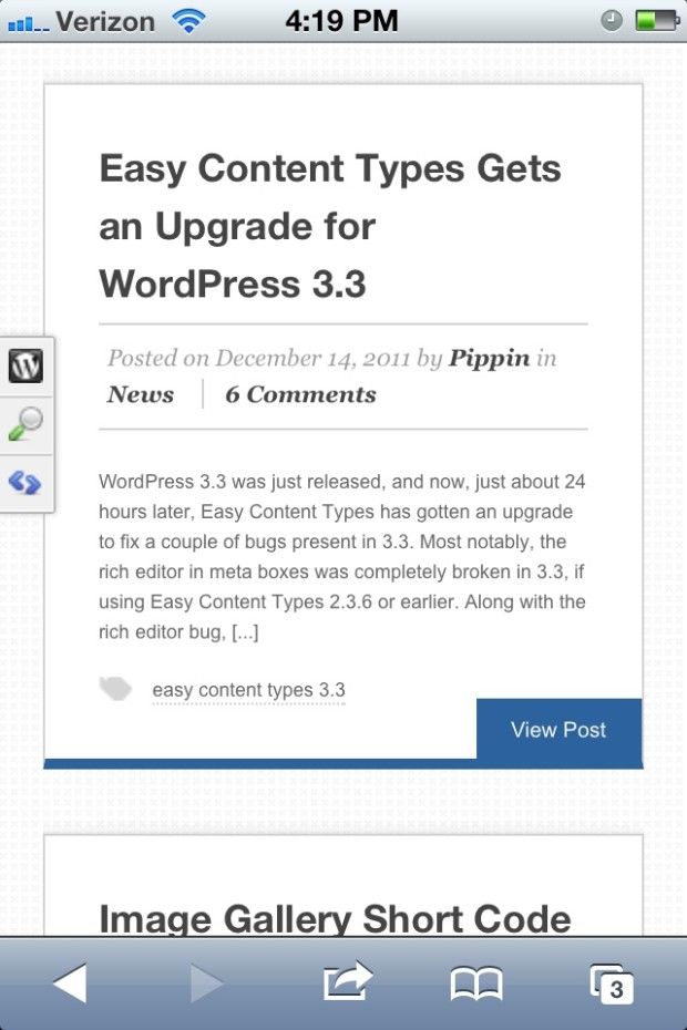
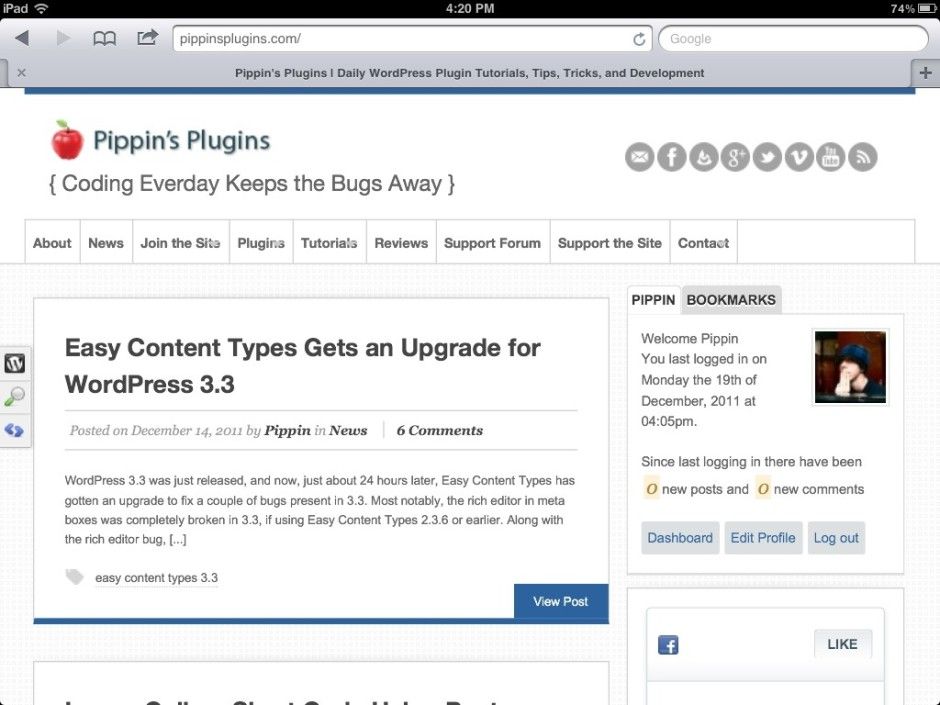
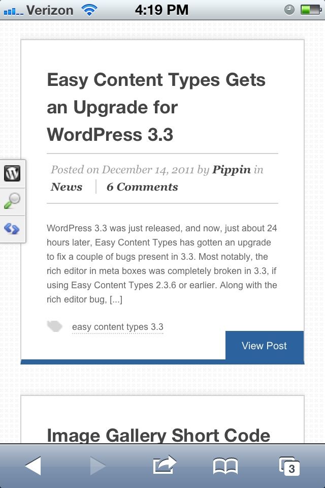
It’s been greatly needing it for a while now, but today I am glad to announce the launch of the brand new design on Pippin’s Plugins. I know it’s not technically the new year yet, but it’s close enough. Aside from just looking a thousand times better, the site has also had some work done on it in terms of organization and content layout, making things much easier to read and find.
One of the big things I’m really excited about is to announce that the site is now completely responsive, with layouts for all small displays, including iPhones, Black Berries, iPads, and all other small resolutions.


What do you think of the new design? Go ahead and tell me either in the comments or on FaceBook.
A huge thanks goes out to Jason Bobich for his wonderful Swagger theme.


Nicely done, Pippin. Looks great around here.
Thanks, Brian!
LOVE the new design!!!
Thanks Jason, though credit really goes to Jason Bobich 🙂
Great choice for the new look! Jason Bobich does some nice stuff…
Much more of a ‘tech’ look 🙂
Thanks! He really does some nice stuff, and not just in the design department. His code is excellent too, which was very, very important for me in choosing a theme.
But you still can’t beat StudioPress and Genesis… 🙂
Ha, that is certainly how a lot of people feel.
I like it. Great choice of themes.
Thanks Bill!
I also love the new design, nice, clear and clean and useable! Great you’re going in the direction of child themes now – one step closer to Genesis… 🙂
One minor suggest: to make the color of the comment textarea input field (where I write this right now) a little darker – it’s light grey on white and could be a bit more contrast…
Thanx a lot for your work – and I curious what will come for us soon 🙂
-Dave.
Yep, I’m running on a Swagger child theme now 😉
I agree with the textarea color. There are a few other areas that need some contrast improved. I’ll get to them slowly over the next week or so.
The design is all a bit bright for my eyes (please don;t tell me to adjust my monitor), and the text is too small and too light. We are not all 20 years old with perfect eyes.
Also, I’m surprised that the member login screen has the default WordPress logo and takes you to the useless admin page. All default actions that need adjusting !
Otherwise I like the design, very clean and stylish.
@Richard – I appreciate the honest feedback. Which login screen are you referring to? Yes the default one is there, but the main login is through the top of the sidebar. I’m going to be making some contrast adjustments over the next week to improve the “brightness” issue.
I like it. it’s very clean looking. The icons are a nice touch too.
Thanks!
Loving the new design Pippin, it’s very clean and so easy to browse!
And I’ve dutifully checked it out on the iPhone now too, the responsiveness looks great there! Really liking it 🙂
Great choice of theme and nice work in making it your own!
Thanks Michael!
Wow, still being directed to the WordPress default logon page. I logon, then it takes me to the dashboard, and when I try to go back to the site it automatically logs me out — and takes me back to the WP login screen! And so round and round we go.
Sorry about that. I was testing a function and it seems to have gone bizzerk. I’ve just removed it, so please try again now.
Ahhhh. That’s better. I was admiring how beautiful the little login widget was 🙂
By the way, since this is now my defacto login discussion, I bought a premium login widget that does many of the things your does (though not quite as pretty), but one thing it falls down on is that it has a “register” link. I’ve since manually deleted that, but before I did I got loads of spam accounts signing up. Does your login widget allow the registration tab to be deleted/hidden?
Good, that was annoying indeed.
I didn’t write the login widget plugin, but yes, you can easily remove it. You have to modify the source code, but it’s quite simple.